

Day Trading Patterns For Forex Beginners: An Intro To Chart, Patterns, Tips, And More.
If you’re a beginner in the Forex market, chances are you are looking for the best and easiest trading patterns to become profitable. In this article, we will be discussing different chart types, their pros and cons, and then discuss the most famous and easy-to-use trading patterns and how you can use them to become profitable in Forex, Keep reading to find out.
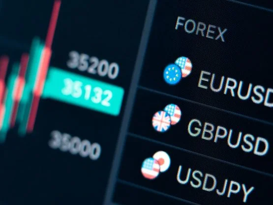
Price charts in Forex
A price chart essentially represents changes in supply and demand. A chart aggregates every buy/sell transaction of a currency pair at any given moment of time.
Any financial asset, including Forex currency pairs, that has price data over a specific period of time, can be used to form a chart.
Price changes are a series of primarily random events, so your job as a trader is to manage the risk and assess the probabilities, and that’s where charting can help you.
Charts are beginner-friendly since it’s pretty easy to understand how price movements are presented over time in a very visual manner.
It is relatively easy to identify and analyze a currency pair’s movements, patterns, and tendencies with a chart.
Types of Price Charts
Let’s take a look at the three most popular types of price charts:
Line chart
A simple line chart consists of a series of points drawn from a closing price to the next one. When connected together with a line, we can see the general price movement of a currency pair over a specific period of time. All you get from line charts is that the price closed at a particular point at the end of a certain period. You have no clue what else happened in the meantime or how it happened. But it does help you to see trends more quickly and visually compare the closing price from one period to the next. *insert pic of line chart*
Bar chart
Bar charts are more complex than line charts. A bar chart shows the opening and closing prices, in addition to the highs and lows. Bar charts help you to see the price range in each period.
Each bar is essentially one segment of time, whether it’s one hour, one day, or one week.
When you see or hear the word “bar,” make sure you understand what time frame it is in reference to.
You should know that bar charts are also known as “OHLC” charts simply because they indicate the Open, the High, the Low, and the Close for a particular currency pair.
The main difference between a line chart and an OHLC chart is that the latter chart shows volatility.
*insert pic of bar chart*
Candlestick chart
Candlestick charts are a famous variation of the bar charts.
They show the same price information as a bar chart but in a more visual and graphic format.
Many traders use this type of chart because not only is it more visual, but it’s very much easier to read.
Candlestick bars depict the high-to-low range with a vertical line.
However, the larger block (or body) in the middle depicts the range between the opening and closing prices in candlestick charting.
Candlesticks help visualize bullish (uptrend) or bearish (downtrend) sentiment by displaying “bodies” using different colours.
Traditionally, if the block in the middle is filled or coloured in, then the currency pair closed lower than it opened. And if the closing price is higher than the opening price, the block in the middle will be hollow or unfilled.
Yet, now most charts use green and red to show the sentiment of the market. This means that if the price closed higher than it opened, the candlestick would appear green. If the price closed lower than it opened, the candlestick would appear red.
The purpose of candlestick charting is strictly to serve as a visual aid since the same information is also available on an OHLC bar chart.
The advantages of candlestick charting are:
- Candlesticks are easy to interpret and suitable for beginners to figure out chart analysis.
- Research shows that visuals help with studying, so they might help with trading too.
- Candlesticks and candlestick patterns have memorable names. That can help you remember what the pattern means.
- Candlesticks are good at identifying market turning points, which means trend reversals, an uptrend to a downtrend, or a downtrend to an uptrend.
There are many different chart types, and they all have their pros and cons. The data may be the same to create them, but the way that data is presented and interpreted will vary on different chart types.
This article will discuss candlestick charts, as they are the primary type of charts that you as a beginner will deal with.
Best Day Trading Patterns in Forex
Out of the many various methods to use technical analysis for day trading, chart patterns are by far the most used and most researched. The vast majority of strategies in Forex technical analysis require some sort of a breakout to ignite the trading sequence. The most typical chart patterns are shapes like rectangles and triangles.
Chart patterns are very tricky to recognize and deal with because of our brain biases, which means that a trader with an internal bias is more likely to spot patterns that agree with his position or idea while subconsciously filtering out the patterns against their position or idea.
Breakouts & Reversals
In the patterns and charts that we will discuss below, you will see two recurring themes, breakouts and reversals.
- Breakout – A breakout is when the price clears a specified critical level on your chart. This level could be any number of things, from a Fibonacci level to support, resistance or trend lines.
- Reversal – A reversal is simply a change in the direction of a price trend. That change could be either positive or negative against the prevailing trend. You may also hear it called a ‘rally,’ a ‘correction,’ or a trend reversal.
Japanese Candlesticks, an overview
Japanese candlestick patterns are naturally complementary to chart patterns and can be used simultaneously. Therefore, for the purposes of this tutorial, we will discuss Japanese candlesticks too.
Before the 21st century, most trading materials and technical analysis did not include Japanese candlesticks. American bar charts were the most popular chart style among traders for almost 100 years back then.
It all changed when Hidenobu Sasaki presented his innovative work in Japanese candlesticks to the Western markets. Japanese Candlesticks quickly became the technical analysis and trade world’s new standard, to the degree that now Japanese candlesticks are the defacto chart style.
Japanese candlesticks are now the first chart-style thought to new traders and since then have become the building block for every beginner Forex tutorial.
Word of caution: Japanese candlesticks analysis is an advanced method of analysis that requires learning and practicing for a long time before you can understand or use it. Varied patterns can emerge in the Japanese candlestick charts – sometimes simultaneously – each with different interpretations regarding the time and volume of the trades.
When used correctly, Japanese candlesticks are a powerful tool for day traders.
Japanese Candlestick Patterns
There are many Japanese candlestick patterns variations. We don’t want to exaggerate, but there are well over 200 documented candlestick patterns, and memorizing all of them and recalling them when live trading is very unlikely. However, learning and practicing the most powerful patterns can help you yield the best results.
We will only be discussing the bullish side of the patterns for educational purposes.
Bear in mind that all candlesticks contain valuable information. They can tell you where the price started, how the price movement went, and where the price finally settled.
Bullish Hammer Pattern
The bullish hammer is a candlestick where the wick is at least twice as long as the body. Above the candle’s body, there is usually little to no wick. You want to look for the bullish hammer pattern at the bottom of a move in your chart. The bullish hammer is a strong indicator of a reversal move that is about to happen.
The bullish hammer states that sellers are giving up, and buyers are taking over the show. However, you need to look for an increase in buy volume to get a confirmation for this pattern. The volume should be higher than the previous candlestick and ideally more than twice the 20-period volume average.
Note: The bullish hammer candlestick can be red or green; therefore, the colour does not matter.
Bullish Engulfing Candlestick
The most popular and sought-after bullish candlestick pattern is Bullish Engulfing Candlestick. Bullish engulfing candlestick is the most confirming pattern for a bullish move out of all single candlestick patterns. The bullish engulfing candlestick indicates that the bulls have taken the market by storm and are in a strong position. This pattern nearly always results in higher trending prices.
Chart Patterns
In addition to the abovementioned candlestick patterns, day traders seek out powerful trend continuation patterns. Some of the world’s most consistent and profitable traders trade only these types of patterns.
Continuation patterns fall into two categories:
- Flags or rectangles
- Pennants or triangles
These patterns are frequent, common, and yet powerful. Once you can successfully trade these patterns, you are very close to becoming a consistently profitable trader.
Here are the three most common bullish continuation patterns:
- Bull Flag
- Bullish Pennant
- Rising Wedge
Bull Flag
A bull flag is a type of channel (a rectangle), With a bull flag. You often see it move in one of two ways:
- Horizontally
- In a downward channel.
The most common one is the downward channel.
A flag pattern, in technical analysis, is a price chart characterized by a sharp countertrend (the flag) succeeding a short-lived trend (the flag pole).
A bullish flag appears like an upright flag on a price chart, with a rectangular price pattern marking the flag itself.
The tighter the flag, the better the signal is said to be. You often see prices move swiftly higher because the short traders are squeezed out of their position.
*insert picture of bull flag*
Bullish Pennant
A bullish pennant (rectangle) is a technical trading pattern that indicates the impending continuation of a strong upward price move.
A bullish pennant is formed when the market makes an extensive move higher, then pauses and consolidates between converging support and resistance lines.
Technical traders take this as a strong sign that the original ascending price move will resume. Therefore, the bullish pennant pattern is particularly sought after, as it can offer an early indication of significant upward price action.
The ascending triangle forms when a flat top with an upward sloping trendline exists.
If you have opened a short position or attempting to short inside an ascending triangle, this is a very, very painful pattern. During the formation of the pattern, the resistance formed at the flat top convinces more and more shorts that the resistance will hold. However, the weight of the bulls continues because there continue to be new higher lows.
An aggressive trader may want to enter on the initial break of the flat top of the ascending triangle. But we suggest a more conservative method, which is waiting for a retest of the break.
*insert bullish pennant picture*
Falling Wedge
A wedge pattern is very much similar to a triangle pattern, except the two trendlines do not intersect (at least not at any foreseeable point).
Wedge patterns are associated with a fast descent in price at a fairly sharp angle. Wedge patterns are powerful bullish reversal signals and represent low risk and high reward opportunities.
*insert falling wedge picture*
Additional beginner tips for day traders in Forex
- To help determine the best moment to buy a currency pair, check three things:
- Candlestick patterns, including engulfing candles and Doji stars
- Technical analysis, including trendlines and triangles
- Volume—increasing or decreasing
As a day trader, you can look for many candlestick setups to find a suitable entry point.
- Look for a confirmation sign before trading the pattern:
- Check volume for confirmation of your position
- Check prior support and resistance levels and see if your position makes sense regarding those
- Check all other open orders and their sizes before deciding
What can Arongroups do for you?
Aron Groups is a Forex Broker that can make scalp trading easier for you. You can deposit and withdraw easily and with no commission and wages, using Visa, Mastercard, PayPal, etc. You can also enjoy a 2% cashback by depositing USDT.
You can open up different accounts such as standard, VIP, Nano and Cash, and use the most up-to-date MT5 trading platform.
Aron Groups provides you with security and excellent customer service that any other broker cannot match.
To register with Aron Broker, Click Here, Or you can read about frequently asked questions here.
The Bottom Line
A price chart essentially represents changes in supply and demand. A chart shows all buy and sell transactions of a currency pair at any given point in time. Out of the many various methods to use technical analysis for day trading, chart patterns are by far the most used and most researched. The vast majority of strategies in Forex technical analysis require some sort of a breakout to ignite the trading sequence. The most typical chart patterns are shapes like rectangles and triangles.
Identifying trend continuation patterns like the ascending triangle, bull flag, and falling wedge create powerful trading opportunities.