


Have you ever searched for a way to get clear buy and sell signals without the usual complexity of candlestick charts? The Line Break Chart is a lesser-known yet highly effective tool in technical analysis designed for precisely this purpose.
By disregarding the time variable and focusing solely on price action, this chart helps traders identify the underlying market trend and filter out insignificant fluctuations and misleading market noise. If you’re looking to gain a deeper understanding of this powerful and practical tool, read on as we explore its key features.

- This chart performs significantly better in strongly trending markets (like stock indices) than in sideways or highly volatile assets (such as certain currency pairs).
- The number of consecutive, same-colored lines indicates the trend's strength and momentum; a trend with ten consecutive lines is considerably stronger than one with only three.
- Before trading with a live account, it is essential to backtest different settings (e.g., three-line versus five-line) on the historical data of your chosen asset.
What is a Line Break Chart and How is it Used?
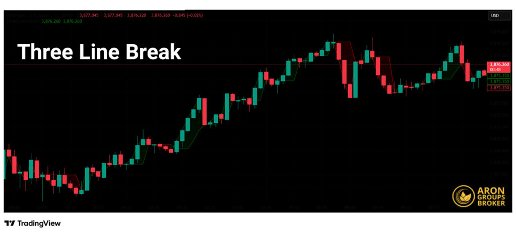
The Line Break Chart, often referred to as the Three-Line Break Chart, is a technical analysis tool introduced to the Western world by Steve Nison. Originating from Japan, its construction is unique: unlike bar or candlestick charts that plot price against fixed time intervals (e.g., daily or hourly), the Line Break Chart is built exclusively based on price movements.
The primary objective of this chart is to filter out market noise and reveal the prevailing market trend. In practice, a new line is only drawn once a significant price reversal occurs. This characteristic makes the Line Break Chart highly effective for identifying potential reversal points and confirming continuation trends, helping traders avoid entering high-risk positions in volatile market conditions.
The Structure and Formation of Line Break Charts in Technical Analysis
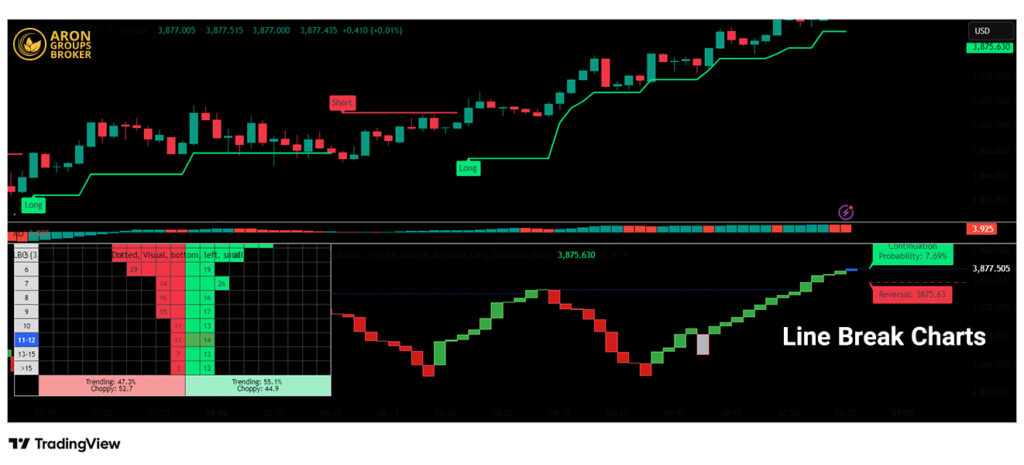
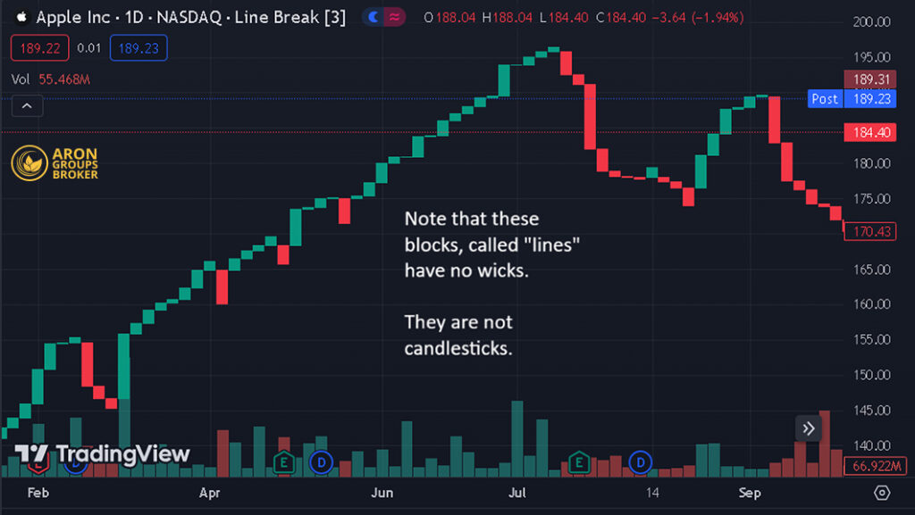
The foundation of a Line Break Chart is quite simple. The chart consists of a series of vertical columns, often called “lines,” which are typically colored green for uptrends and red for downtrends.

Getting accustomed to a Line Break Chart may take some time. Although it looks similar to a standard chart, you must never forget that its structure and functionality are entirely different.
The Underlying Logic of Price Action
The chart’s logic is based on comparing the current closing price to the high and low of previous lines. A new bullish line is drawn only when the current close exceeds the high of the prior bullish line. Similarly, a new bearish line is formed when the current close falls below the low of the prior bearish line. However, the most critical element lies in the reversal signals.
Step-by-Step Rules for Plotting a Line Break Chart
The process for constructing the chart is as follows:
- First Line: The first line is plotted based on the closing price of the initial period, typically extending from the opening price (Open) to the closing price (Close).
- Bullish Lines (Continuation): If a new closing price moves above the high of the previous line, a new green (bullish) line is drawn from the high of the prior line up to the new closing price.
- Bearish Lines (Continuation): If a new closing price falls below the low of the previous line, a new red (bearish) line is drawn from the low of the prior line down to the new closing price.
- The Reversal Rule:
- Bullish Reversal: For a bullish (green) line to appear after a downtrend, the current closing price must exceed the high of the previous three bearish lines.
- Bearish Reversal: For a bearish (red) line to appear after an uptrend, the current closing price must fall below the low of the previous three bullish lines.
The Significance of Shifting Lines in Identifying Trend Changes
The shifting of the columns, evidenced by a change in color, is the most important signal on a Line Break Chart. The appearance of a line with an opposing color indicates a potential change in the market’s direction. Because this signal is generated only after a significant price move, it is considered highly reliable and can serve as a strong confirmation for trade entries and exits.
Types of Line Break Charts
The core idea behind choosing a type of Line Break Chart is finding the right balance between the speed and the reliability of its signals. The number—whether “three” or “five”—effectively acts as a filter for market volatility. The higher the number, the stronger the filter, allowing only very large and significant price movements to register as a new reversal line.
The Three-Line Break Chart
This is the most popular and commonly used type of Line Break Chart because it strikes an excellent balance between two primary goals for traders:
- Timely Responsiveness: By requiring a break of only the previous three lines, the chart reacts relatively quickly to trend changes. This feature allows traders to avoid missing a large portion of a new trend.
- Filtering Minor Fluctuations: At the same time, the chart is robust enough to ignore small, day-to-day market movements (commonly referred to as “noise”). As a result, you won’t receive signals on every minor move, which helps prevent emotional and erroneous trades.
Who is it best for?
- Swing Traders: Those looking to capture market moves that last several days or weeks.
- Day Traders: When used on higher timeframes (e.g., one-hour) to identify the primary intraday trend.
- Moderately Trending Markets: The chart performs excellently in markets that have clear trends without extreme volatility.
Main Risk: In highly volatile or sideways (range-bound) markets, it can produce false signals, known as whipsaws. This occurs when a reversal signal is generated, but the price immediately reverts to its previous trend.
The Five-Line Break Chart and Higher
When a trader changes the chart’s setting to five, eight, or even ten, they are essentially telling the market: “I only care about a move powerful enough to negate the price action of the past five trading periods.”
- Very High Reliability: Reversal signals on these charts are extremely reliable. When a reversal line appears, it can be said with much greater confidence that a significant trend change is underway.
- Significant Reduction in False Signals: These charts filter out nearly all short-term fluctuations, helping traders focus on the bigger picture and the primary trend. This feature dramatically reduces trading stress.
Who is it best for?
- Position Traders: Long-term investors looking to capture major trends that last several months or even years, who are not concerned with weekly fluctuations.
- Traders in Highly Volatile Markets: Such as the cryptocurrency market, where intense daily volatility can create numerous false signals on a three-line chart.
- Conservative Traders: Those who prefer to enter a trade later but with greater certainty about the signal’s validity.
Main Risk: Lagging signals. Since you must wait for a very large price move to receive a signal, you will miss a significant portion of the new trend's beginning. In other words, you enter later and exit later.
Comparison of Line Break Chart Types in Terms of Accuracy and Signaling
This table will help you better understand the differences:
| Feature | Three-Line Chart (More Sensitive) | Five-Line Chart & Higher (More Filtered) |
|---|---|---|
| Number of Signals | More (reacts to smaller movements) | Fewer (only reacts to large, decisive moves) |
| Signal Speed | Faster (signals on a relatively small reversal) | Slower (waits for a large, confirmed reversal) |
| Signal Reliability | Good (but with a chance of false signals) | Very High (signals are rarely incorrect) |
| Best Suited For | Short-term and medium-term trading | Long-term investing and position trading |
| Main Risk | Whipsaws (False Signals): Entering a trade that immediately becomes a loss. | Missed Opportunity (Lag): Missing the initial, profitable part of a new trend. |
Final Conclusion: The choice between a three-line and a five-line chart is not a matter of “good” versus “bad.” Rather, it is a strategic decision based on your trading personality, risk tolerance, and the specific market you are analyzing. It is best to experiment with both on a demo account to see which is more compatible with your strategy.
Trading Signals on the Line Break Chart and How to Interpret Them
A key advantage of the Line Break Chart is the simplicity and clarity of its signals. Unlike many complex indicators that require multiple interpretations, this chart presents only two primary states: Trend Continuation or Trend Reversal. All trading signals are derived from these two concepts.
How to Identify Reversal Signals for a Trend Change
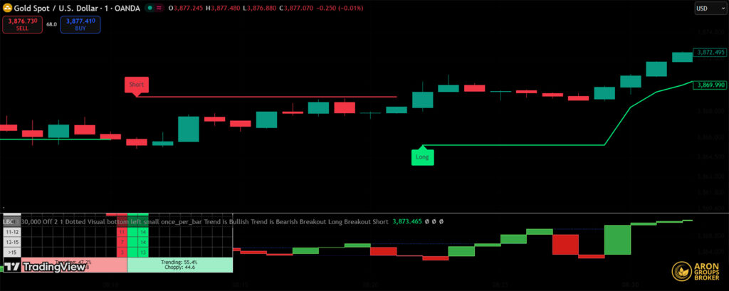
The reversal signal is the most important and fundamental signal on this chart. It is generated when control shifts from buyers to sellers (or vice versa), and this transfer of power is strong enough to negate the price action of the last few periods.
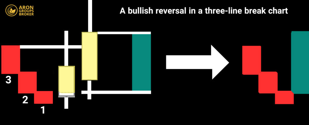
Buy Signal (Bullish Reversal): A Shift in Control from Sellers to Buyers
Scenario: Imagine the market is in a clear downtrend, and the chart has printed several consecutive red lines. These lines indicate that sellers are in control, consistently pushing the price to lower levels.
The Turning Point: Suddenly, a strong bullish move occurs. This move is so powerful that the closing price not only moves above the low of the previous line but closes above the high of the last three bearish lines.
Market Interpretation: This event sends a very clear message: “The buying pressure has become so significant that it has overcome the selling pressure of the last three periods.” This is a strong signal that the downtrend has likely ended and a new uptrend is about to begin. The appearance of the first green line after a series of red lines constitutes the buy signal.
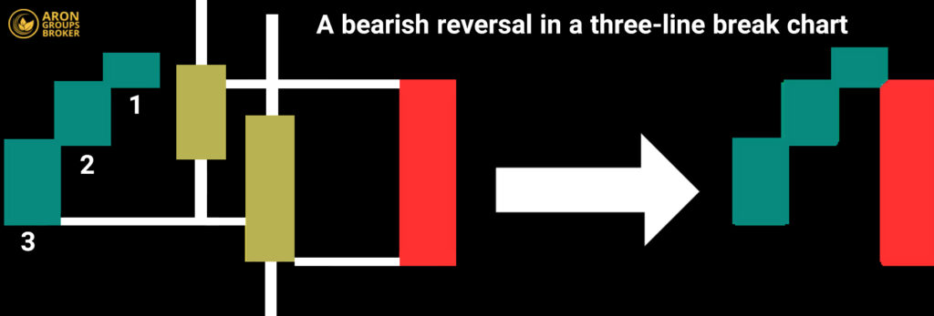
Sell Signal (Bearish Reversal): A Shift in Control from Buyers to Sellers
Scenario: The market is in a strong uptrend, with the chart showing multiple consecutive green lines. This indicates that buyers are in complete command.
The Turning Point: Suddenly, selling pressure increases sharply, and the price falls to the extent that the closing price settles below the low of the last three bullish lines.
Market Interpretation: This signal tells us that sellers have entered the market with force, managing to neutralize all the buying efforts of the last three periods. It is a serious warning sign that the uptrend may be over. The appearance of the first red line after a series of green lines is a definitive sell signal.
How to Identify Continuation Trends Using the Line Break Chart
This part of the analysis is even simpler than identifying reversals. As long as the chart continues to produce lines of the same color, the current trend remains firmly in place.
- Bullish Continuation: A series of consecutive green lines signifies that the uptrend is still strong. Each new green line confirms the continued strength of the buyers. In this situation, the best strategy is to hold a long position. The greater the number of consecutive lines, the stronger the trend’s momentum and strength.
- Bearish Continuation: Similarly, observing multiple consecutive red lines indicates that selling pressure continues to dominate the market and the downtrend is ongoing. Until a green line appears, there is no reason to close a short position or look for a buying opportunity.
Determining Timely Entry and Exit Points
Knowing the right time to enter and exit a trade is what separates a profitable trade from a losing one.
The Entry Point: Acting After Confirmation
When should you enter? The best and lowest-risk time to enter a trade is after the candle that created the reversal line has fully closed. Do not rush; wait for the signal to be confirmed on the chart.
- Example for a Buy Entry: Following a downtrend, the price rallies and a green line appears on the chart. You should wait until the end of that time period (e.g., the close of the daily candle). If the green line remains, you can enter a long position at the beginning of the next candle.
Why is this important? During a trading session, the price might temporarily break above the high of the last three lines but then fall back below it by the close, causing the buy signal to disappear. Waiting for the close prevents you from making hasty and erroneous entries.
The Exit Point: Exiting at the First Sign of Weakness
- Primary Exit: The exit strategy on this chart is as simple as the entry. You remain in your trading position until the first line of the opposing color appears.
- Example: You are in a long position, and the chart has printed several consecutive green lines. As soon as the first red line appears, it is a clear signal to exit the trade and take profit.
- Risk Management with a Stop-Loss: Always set a stop-loss for your trades. A logical and effective method for placing a stop-loss with this strategy is as follows:
- For a Buy Trade (Long Position): Place your stop-loss slightly below the low of the same green line that signaled your entry. If the price falls below this level, it implies the initial signal was false, and you should exit the trade with a minimal loss.
- For a Sell Trade (Short Position): Set your stop-loss slightly above the high of the same red line that issued the sell signal.
Combining the Line Break Chart with Support and Resistance Levels
By itself, the Line Break Chart tells us when control has shifted from buyers to sellers (or vice versa). However, it does not tell us where this shift occurred. Support and resistance levels fill this exact gap; they are key levels on the price chart where the market has historically reacted.
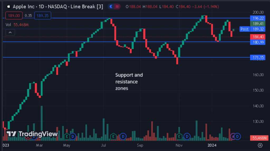
When a reversal signal from the Line Break Chart occurs precisely at one of these key zones, the signal’s reliability is significantly enhanced. In effect, you receive two powerful confirmations from two different perspectives:
- Confirmation from the Line Break Chart: The market’s strength and momentum have shifted.
- Confirmation from the Key Levels: This shift in power has occurred in a strategic and historically significant area.
Combining the Line Break Chart with MACD
- Line Break Chart: This is a trend-following and lagging indicator. It follows the trend and issues a signal only after a definitive change in price has occurred.
- MACD Indicator: This is a momentum and leading indicator. Through weakening trend strength (visible in the histogram and divergences), the MACD can provide a warning before the price completely changes direction.
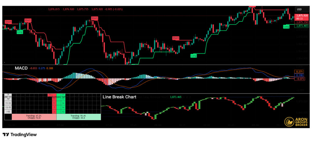
The magic of this combination is that the MACD provides the “early warning,” and the Line Break Chart delivers the “final confirmation” for entry. This approach helps prevent premature entries while providing a more optimal entry point than using the Line Break Chart alone.
The most effective way to use this combination is by looking for divergence on the MACD.
Combining the Line Break Chart with RSI
The role of each tool in this strategy is distinct:
- RSI (Relative Strength Index): This is a momentum oscillator that measures the speed and change of price movements. The primary function of the RSI in this strategy is to identify overbought and oversold zones. These areas warn us that a trend may be overextended and is running out of energy to continue.
- Line Break Chart: As before, this plays the role of the final confirmation. It tells us that the warning issued by the RSI has now been validated by the actual price action.
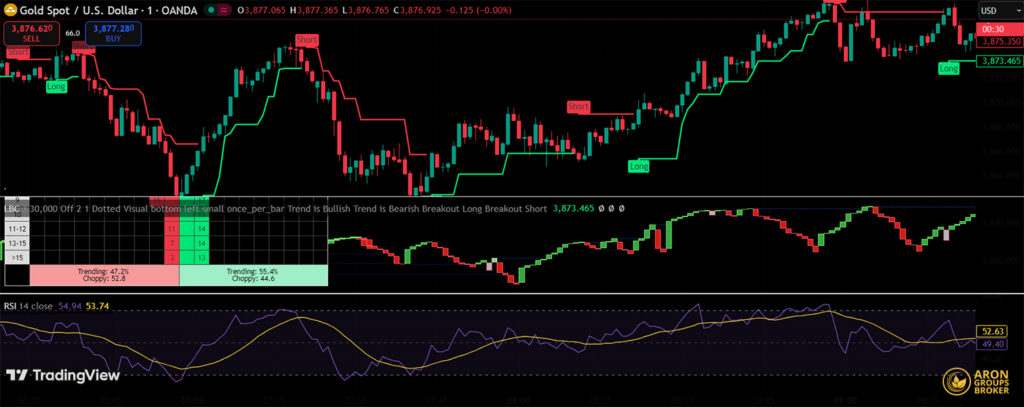
This combination helps traders avoid acting on weak reversal signals that occur in the middle of a trend under normal market conditions. Instead, it allows them to focus on high-probability signals that originate from points of peak market sentiment, or market extremes.
Pros and Cons of the Line Break Chart in Technical Analysis
Below, we explain the advantages and disadvantages of this chart.
Advantages of the Line Break Chart
The strengths of this chart primarily stem from its core philosophy: “simplification and a focus on the primary trend.”
1. Exceptional Simplicity and Visual Clarity
By eliminating complex details like candlestick wicks, this chart provides a clean and easily understandable view of the market trend. The buy and sell signals are unambiguous and require no interpretation, making it ideal for quick analysis and for traders who are new to the markets.
2. Excellent Filtering of Volatility and Market “Noise”
Its most significant advantage is its ability to ignore small, insignificant price movements. This feature allows the underlying market trend to be seen clearly and helps prevent emotional decisions caused by minor fluctuations.
3. Objective, Rule-Based Signals
The rules for plotting the chart and generating signals are clearly defined. This eliminates subjective interpretation and ensures that all analysts see the same signals, which lends credibility to a trading strategy.
4. Reduced Stress and Emotional Trading
Because the chart only changes when a meaningful price move occurs, traders are not forced to constantly monitor the market or react stressfully to every minor tick. This calmer approach greatly aids in logical decision-making, free from the heat of the moment.
Disadvantages of the Line Break Chart
The weaknesses of this chart arise from the very same characteristics that create its strengths.
1. Lagging Signals
This is the biggest drawback of the Line Break Chart. Because a reversal signal is only generated after a significant price move in the opposite direction (e.g., breaking the low of the previous three lines), the signal is always delayed. This means you will never buy at the absolute bottom or sell at the absolute top; you will miss the initial part of a new trend. For very short-term traders (scalpers), this lag can severely reduce profitability.
2. Omission of Important Price Details
The chart’s simplicity comes at the cost of losing valuable information. With a Line Break Chart, you do not have access to details such as:
- Price Gaps: Which indicate intense market sentiment.
- Candlestick Patterns: Such as the Doji, Hammer, or Engulfing patterns, which can provide very early reversal signals.
- Long Wicks (Shadows): Which indicate price rejection by the market.
In effect, you lose a large part of the story and the “battle” between buyers and sellers within each time period.
3. Less Effective in Sideways or Range-Bound Markets
The Line Break Chart is a trending tool and performs best in markets with a clear direction. In sideways markets, where the price oscillates between support and resistance levels, the chart can generate frequent and false buy/sell signals (whipsaws), leading to a series of losses.
4. Does Not Display Trading Volume
important tools for confirming the validity of a price move. A trend break accompanied by high volume is far more reliable than one that occurs on low volume. The Line Break Chart provides no volume information, requiring you to use a separate indicator to analyze it.
Conclusion
The Line Break Chart is a powerful yet simple tool for technical analysis that gives traders a clear view of market trends by focusing on actual price action and filtering out insignificant noise. This chart is particularly useful for Trend Traders who are looking for reliable entry and exit signals.
Although it has its limitations, like any other tool, its effectiveness can be significantly improved by combining it with other indicators and having a solid understanding of its underlying logic. Remember that success in trading depends, above all, on sound risk management and adherence to a defined strategy. The Line Break Chart can be an invaluable tool in your analytical toolkit.
Source: Earnforex.com