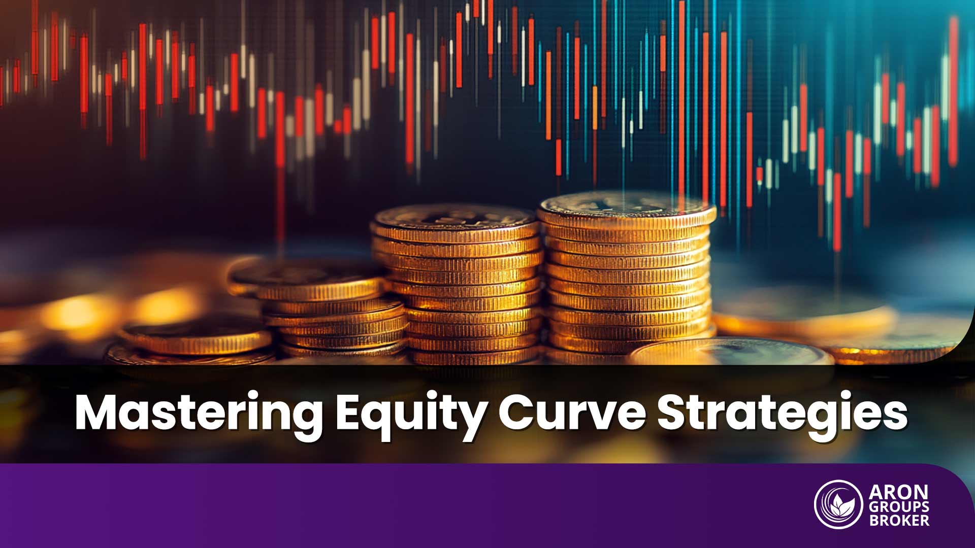


An equity curve trading strategy helps traders track performance trends and make smarter risk decisions over time. Instead of focusing only on entries, it highlights drawdowns, recovery strength, and consistency across changing market conditions. In Forex and other markets, an equity curve can reveal when to reduce exposure and protect capital before losses compound.
If you want a clearer view of strategy health, start monitoring your equity curve alongside your trading plan.

- A strong equity curve trading strategy is judged by behaviour across market regimes, not by its best month on the chart.
- The real meaning of the equity curve is risk control: a stable process beats chasing a perfect-looking curve.
- In a forex equity curve, consistency matters more than excitement; smooth equity curves are easier to trade and manage.
- Trading the equity curve works best when it is rule-based, so decisions stay consistent during stress and recovery phases.
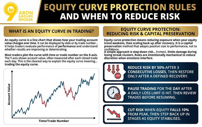
What Is an Equity Curve in Trading?
An equity curve is a line chart that shows how your trading account value changes over time. It can be displayed by date or by trade number, depending on your tracking method.
The curve helps traders evaluate performance and understand whether results are improving or deteriorating. Most traders plot the curve with time or trade number on the X-axis. The Y-axis shows account value, often measured after each closed trade or each day.
This is the clearest way to explain the meaning of the equity curve in practical trading. It also supports better decisions when you are trading the equity curve.
Q: What is an equity curve in trading? Is it only for algorithms?
A: No. Discretionary traders can track equity curve trading by logging results consistently and reviewing regimes monthly.

Key Point:
An equity curve describes realised outcomes, so it works best as a performance feedback tool.
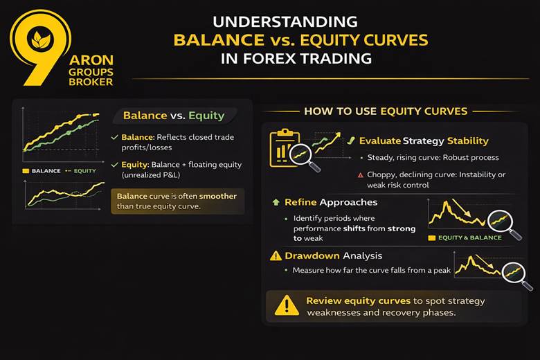
What Is Equity Curve vs Account Balance and Floating Equity?
In forex trading platforms, the balance usually reflects closed profits and losses only. Equity includes the balance plus the unrealised profit or loss on open positions.
That unrealised component is often called floating equity or floating P&L. ThinkMarkets describes floating equity as the unrealised profit or loss on open trades.
If you use this strategy, define which curve you are using. A “balance curve” based on closed trades can look smoother than true equity.
Keep your definition consistent in every report and backtest. Otherwise, your decisions can change simply because the measurement changed.
Equity Curves as a Strategy Diagnostic Tool (Not a Prediction Tool)
Traders review equity curves to understand stability, volatility, and performance “regimes.” A rising curve with controlled variability usually signals a robust process.
A choppy curve can indicate unstable execution, changing market conditions, or weak risk control. A persistent decline can signal that the strategy edge is not present in current conditions.
Investopedia notes that traders use the equity curve to evaluate and refine approaches. That includes monitoring periods where results shift from strong to weak.
This is where equity curve drawdown analysis matters. Drawdowns show how far the curve falls from a previous peak and how long recovery takes.
Focusing on equity curve recovery phases helps you spot whether losses are normal variance. It also helps you recognise when weakness is persistent and requires lower exposure.
More Info:
Diagnostics are most useful when your equity curve includes realistic fees and slippage assumptions.
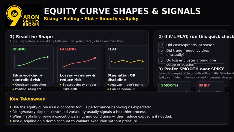
Reading Common Equity Curve Shapes and Signals
An equity curve is a simple chart, but its shape carries actionable information for traders. A steadily rising equity curve signals profitability, while a declining curve signals losses.
Use the curve to judge whether your approach is behaving as expected across time. TraderLion notes that a rising curve suggests the strategy is working, while a flat or falling curve can warn you to adjust.
Also, review risk-to-reward consistency to ensure the slope is sustainable.
Rising, Falling and Flat Equity Curves
- A rising curve often reflects an edge working with controlled risk and consistent execution. It can also indicate that position sizing is appropriate for the current market regime.
- A falling curve may signal strategy decay, poor execution, or oversizing after recent wins. Investopedia links a declining curve to losses, which should trigger review and risk reduction.
- A flat curve can mean stagnation, but it can also show discipline during unfavourable conditions. Several guides describe flat or sideways periods as a warning sign that deserves analysis, not panic.
Quick checklist during “flat” periods:
- Check if costs and spreads increased.
- Check if your trade frequency dropped unusually.
- Check if losses cluster around one setup or session
Equity Curve Stability Versus Spiky Equity Curves in Equity Curve Trading
In equity curve trading, stability usually means smoother growth with smaller, shorter drawdowns. Some sources describe a “good” curve as an overall even slope with small, short-lived dips.
Spiky equity curves can look impressive, but they often hide unstable risk-taking. A “smooth over spiky” preference is common in strategy evaluation because it can signal repeatability.
Operationally, spikiness can increase stress and execution errors during fast markets. It also reduces slippage tolerance because results depend on a few large trades.
Use a forex demo account to verify execution discipline without financial pressure.
Did You Know:
Many broker glossaries define healthy equity curves as steady slopes with small, brief dips, not dramatic surges.
Equity Curve Drawdown and Recovery Phases
A drawdown is the peak-to-trough drop in account equity before a new high forms. This supports equity curve meaning and improves equity curve trading decisions.
Drawdown Control Using Equity Curve with Peak-to-Trough Tracking
Track maximum drawdown as the largest observed peak-to-trough decline before a new peak appears. Investopedia defines maximum drawdown as the largest decline from peak to lowest point before recovery.
Also track drawdown duration, which is the time spent below the prior equity high. Edgewonk highlights recovery time and drawdown length as critical for managing risk and refining a method.
Practical thresholds should be tied to your own history, not social media comparisons. Use determining portfolio risk to keep drawdown limits consistent across strategies.
If drawdowns deepen, reduce exposure rather than seeking faster wins. A position size calculator helps standardise risk when volatility rises.
Drawdown and Recovery Example on an Account Equity Curve
A numeric example shows why drawdowns distort recovery on an account equity curve. A drawdown is the peak-to-trough drop from a prior equity high.
Imagine your trading account peaks at €10,000, then falls to €8,000. That is a 20% drawdown on your trading performance curve. To return from €8,000 to €10,000, you need €2,000 of profit. €2,000 divided by €8,000 equals 25%, so recovery needs a 25% gain.
Now consider a deeper fall from €10,000 to €5,000. That is a 50% drawdown on the performance curve. To break even, you must grow €5,000 back to €10,000. That requires a 100% gain, which becomes harder if sizing stays unchanged.
This is why traders prioritise capital protection before chasing fast recovery.
Drawdown and Recovery Phases on a Trading Performance Curve
In equity curve trading, recovery is a process, not a single winning trade. Your goal is equity curve stability first, then controlled growth.
These equity curve recovery phases help you label what is happening and avoid emotional sizing. They also support equity curve capital preservation when conditions are unfavourable.
A practical journal model uses four phases that repeat across market regimes. Each phase has a different priority, and mixing them causes avoidable drawdowns.
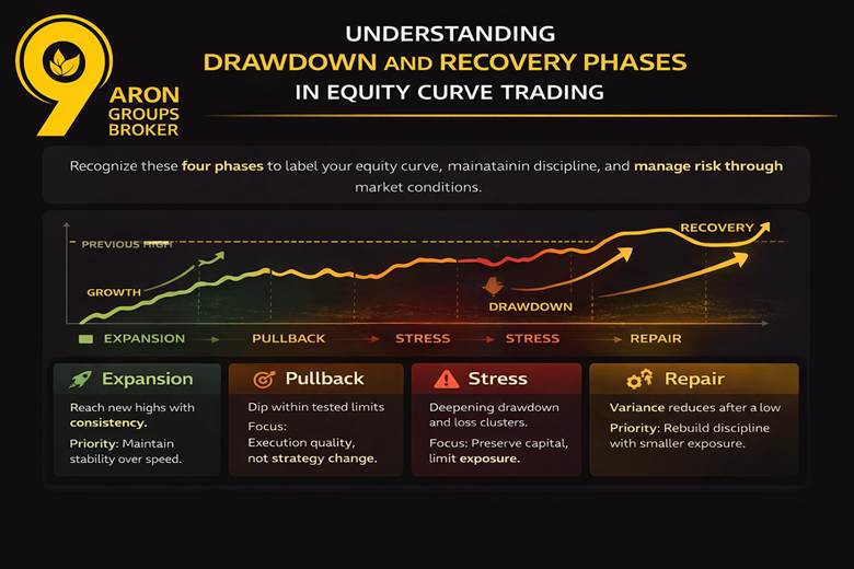
- Expansion starts when the equity curve prints new highs and holds them. The priority is consistency, not speed, because fast gains can hide fragile risk-taking.
- Pullback is a controlled dip that stays within your tested limits. Treat it as feedback, and focus on execution quality rather than changing the strategy.
- Stress appears when the drawdown deepens or extends, and losses begin clustering. This is where equity curve drawdown analysis matters most, because time-to-recover can widen.
- Repair begins when the curve stops making new lows and variance reduces.
The priority is rebuilding process discipline with smaller exposure and cleaner entries.
Key Point:
Recovery speed matters as much as drawdown depth when judging whether a strategy is tradable.
How to Use Risk Metrics for a Consistent Trading Performance Curve
Risk metrics turn an equity curve into a decision tool, not a history lesson. They help you compare equity curves fairly, even when trade frequency differs.
Use these measures to explain why your curve grows, stalls, or becomes unstable. They also guide risk limits in equity curve trading during changing volatility.
| Metric | What it measures | Why it matters for equity curve trading |
|---|---|---|
| Max drawdown | Worst peak-to-trough decline | Sets the worst-case stress test for your account. |
| Volatility of returns | Variability of outcomes | Flags unstable sizing and inconsistent execution. |
| Sharpe / Sortino | Risk-adjusted return | Compares performance while accounting for risk and downside volatility. |
| Profit factor | Gross profit ÷ gross loss | Shows the efficiency of the edge beyond win rate. |
| Win rate + expectancy | Hit rate and average outcome quality | Explains what drives the equity curve slope over time. |
More Info:
Backtesting is commonly used to calculate drawdown and risk metrics before risking capital.
Trading the Equity Curve with Moving Averages and Regime Rules
This part explains how an equity curve trading strategy can adapt when performance shifts. The goal is to reduce exposure during weak periods and re-engage when results stabilise.
Most ranked guides focus on a simple idea. Compare the equity curve to a moving average to manage participation and risk.
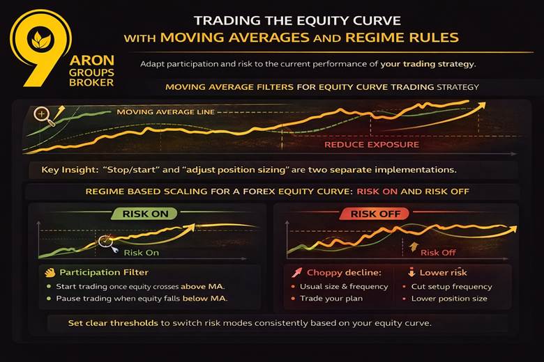
Moving Average Filters for Equity Curve Trading Strategy
An equity-curve moving average acts like a “trading permission” line. When the curve falls below it, you reduce activity or stop trading temporarily.
The first implementation is a participation filter. You pause trading below the moving average and resume once equity crosses back above.
The second implementation is sizing modulation. You keep trading, but reduce or increase position size on equity-curve crossovers.
This approach helps control downside without rewriting entry rules. It can also reduce decision fatigue during drawdown periods.
Key Insight:
“Stop/start” and “adjust position sizing” are two separate implementations of the same equity-curve crossover idea.
Regime-Based Scaling for a Forex Equity Curve Risk On and Risk Off
Regime scaling utilises the slope of the forex equity curve as a practical risk management tool. A stable upward slope indicates normal risk, while a fluctuating decline suggests a need for reduced risk.
Risk-on indicates trading your plan at your usual size and frequency, while risk-off means reducing exposure, trading fewer setups, or pausing until conditions improve.
Set clear thresholds before you trade, so decisions stay consistent. Use drawdown limits and recovery behaviour as your trigger conditions.
Q: Can I apply equity curve trading techniques to discretionary trading?
A: Yes. Use pre-set rules to scale down and enforce them like entry rules.
Equity Curve Capital Preservation and Risk of Ruin
In an equity curve trading strategy, survival depends on limiting losses, not maximising single-month returns. When the equity curve drops, recovery needs a larger percentage gain on a smaller capital base.
This is the practical link between equity curve capital preservation and “risk of ruin”. If risk stays unchanged during deep drawdowns, the account can hit a level that is hard to recover.
The deeper the drawdown, the steeper the recovery maths becomes. A strategy can be profitable, yet still fail, if the risk per trade is too high.
To reduce ruin risk, connect sizing to your risk framework, not emotions. This is where equity curve trading should prioritise rules that keep you in the game.
You can read the “risk and return” article in Aron groups as a reference for consistent risk language and decisions. It helps align recovery targets with survivability rather than short-term performance.
Did You Know:
A 50% drawdown requires a 100% gain to break even. If position sizing stays unchanged, the probability of ruin rises during the recovery phase.
Conclusion
Treat your equity curve as a process control chart, not a trophy, and build a repeatable review routine around it. Set weekly check-ins for execution notes, and monthly reviews for regime changes and strategy fit.
Document only one adjustment at a time, so cause-and-effect stays measurable across your equity curves. This workflow supports steadier decisions in any equity-curve trading strategy, especially when conditions shift. Trading CFDs involves the risk of loss of capital. Consider whether you understand how CFDs work.