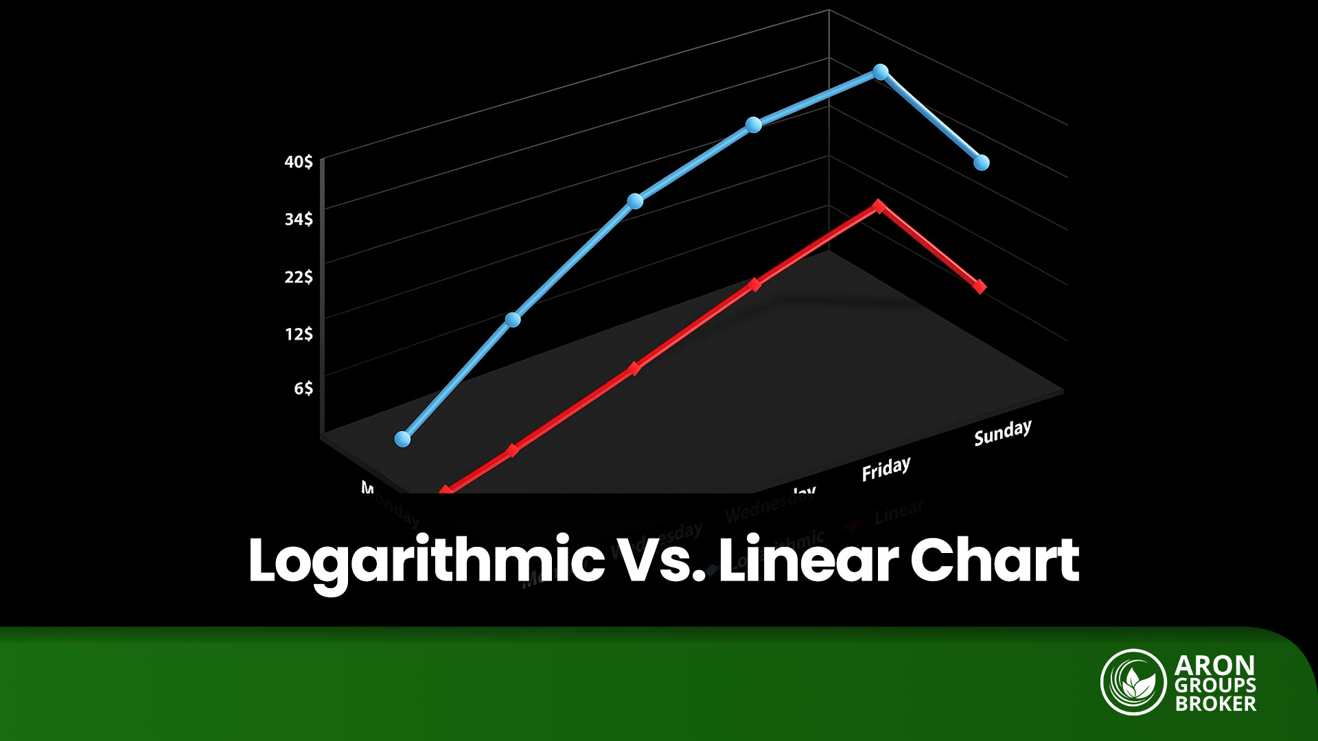


A $10 increase from $10 to $20 represents a 100% jump, whereas the same $10 move from $100 to $110 represents only a 10% increase. A linear (arithmetic) chart displays these two moves as equal because it treats equal price units the same. A logarithmic chart, by contrast, reflects the actual percentage change, giving you a more accurate picture of market moves.
Understanding the difference between logarithmic and linear charts is a key advantage in technical analysis, as it prevents you from overlooking powerful trends. In this article, we’ll explain when to use a logarithmic chart and how to enable it in TradingView so your analysis is clearer and more precise.

- The chart is technically semi-logarithmic because only the vertical axis (price) uses a logarithmic scale; the horizontal axis (time) remains linear.
- A logarithmic chart cannot display zero or negative prices; the price axis always starts from positive values.
- With this scale, you can quickly judge whether the market’s percentage volatility was greater in the past or is higher today.
- In strong uptrends, this scaling keeps the chart more closely aligned with price action and helps reduce visually misleading signals compared to a linear scale.
What Is a Logarithmic Chart?
According to Investopedia, a logarithmic price chart is one in which the vertical axis is scaled so that equal percentage changes correspond to equal vertical distances. In practice, a 10%, 20%, or 50% move occupies the same height on the chart regardless of the absolute price level. For example, a rise from 10 to 15 and a rise from 100 to 150 (both +50%) appear with the same vertical size on a logarithmic chart.
Logarithmic vs Linear (Arithmetic) Charts
The difference between a logarithmic chart and a linear (arithmetic) chart comes down to one question: Do you want to view price changes in absolute terms or percentage terms?
- On a linear chart, equal absolute price changes look the same. A $10 increase from $10 to $20 and from $100 to $110 appears identical on the vertical axis.
- On a logarithmic chart, equal percentage changes look the same. A 50% advance always takes up the same vertical space, regardless of the starting price.
Consider two moves:
- Move A: price rises from $10 to $20 (+100%);
- Move B: price rises from $100 to $110 (+10%).
On a linear chart, both are “+$10” and therefore look equal, an impression that can be misleading, because it hides the much greater return in Move A.
On a logarithmic chart, Move A (+100%) stands out as a much larger jump, while Move B (+10%) appears as a modest step. This view gives a more accurate picture of market reality by highlighting the true size of percentage returns.
Which chart should you use and when?
- Logarithmic chart: Best for long-term trends and high-volatility assets (e.g., cryptocurrencies and high-growth equities). It provides a truer picture of percentage-based growth over multiple price doublings.
- Linear (arithmetic) chart: Well-suited to short-term analysis and markets with limited price ranges, where reading absolute moves in dollars, pips, or ticks is more practical and visually cleaner.
Can You Use a Logarithmic Chart in MetaTrader?
By default, MetaTrader (MT4/MT5) does not support a logarithmic chart. Price charts are displayed on an arithmetic (linear) scale. If you need a percentage-based view, you have two options: use third-party tools within MetaTrader, or perform your technical analysis on TradingView with a logarithmic scale and handle order execution in MetaTrader.

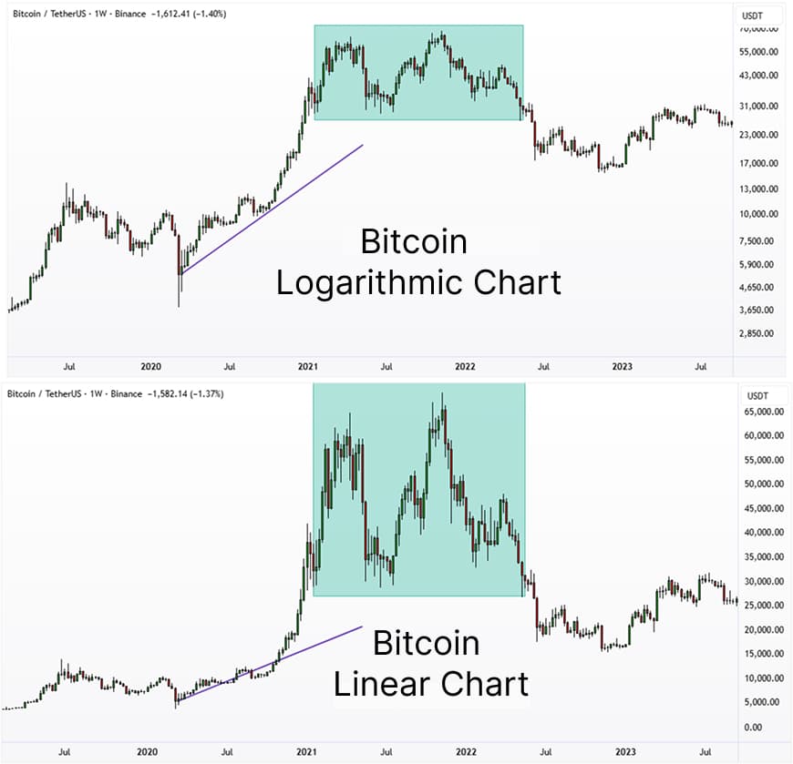
Many assets, such as tech stocks or Bitcoin, often exhibit an exponential growth pattern, and only a logarithmic chart can effectively linearise this type of growth, making it easier to analyse.
Using the Logarithmic Scale in TradingView
You can enable a logarithmic chart in TradingView in just a few clicks and tailor it to your strategy.
Step-by-Step: Enable the Logarithmic Scale in TradingView
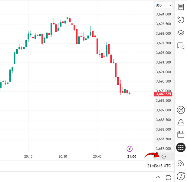
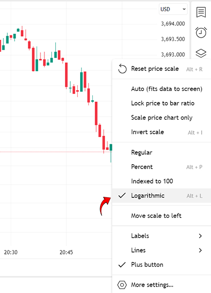
- In the toolbar below the chart, on the right-hand side, click the scale options.
- Click Logarithmic to toggle between linear (arithmetic) and logarithmic modes.
- Your chart will switch immediately, giving you a percentage-based visual of price movements.
Advanced Settings for Customizing the Logarithmic Chart in TradingView
The goal of this section is to ensure your logarithmic chart is precise, readable, and aligned with your analytical use case, especially when you want to compare logarithmic vs linear (arithmetic) charts over long-term trends and conduct log-scale analysis.
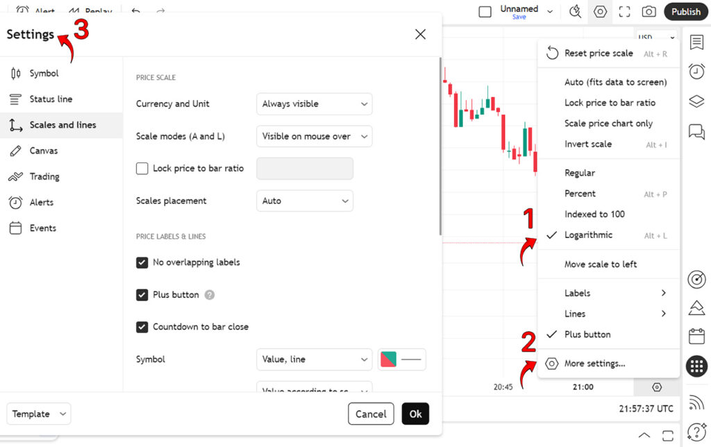
In the Scales and lines section, apply stable and accurate settings:
- Scale modes (A and L): Choose whether the Arithmetic (A) and Logarithmic (L) toggles are Always visible or shown on hover only. If you work mainly with the log scale, keeping them “Always visible” is more convenient.
- Currency and Unit: Display the price currency/unit (e.g., USD) next to the axis to make reports and shared screenshots clearer.
- Lock price to bar ratio: Locks the ratio of candle/bar height to the price range so zooming doesn’t distort candle geometry; on a log chart, this helps preserve trend readability.
- Scales placement: Set the price axis to Left / Right / Auto. When comparing multiple symbols, place one axis on the left and the other on the right for cleaner comparisons.
Price labels & lines:
- No overlapping labels: Prevents label overlap so the chart remains clean and legible.
- Countdown to bar close: Shows the time remaining to bar close, useful on lower time frames for timing entries and exits.
- Symbol (Value, line): Controls the display of the last price line and its current value. Keeping this on is recommended for spotting trendline breaks with greater precision.
Is a logarithmic chart recommended for all markets?
No. It depends on the asset’s volatility, your time horizon, and the purpose of your analysis.
As a rule of thumb, use a logarithmic chart for long-term trends and high-volatility assets, and use a linear (arithmetic) chart for shorter time frames and narrow trading ranges.
Tools such as Andrews’ Pitchfork or Gann lines can produce completely different results on linear and logarithmic scales. Professional traders always test these tools on both scales.
When should you use a logarithmic chart?
A log chart is especially important when analyzing multi-year trends in assets that experience large swings and multi-fold advances, for example, cryptocurrencies and high-growth equities. On this scale, returns are displayed in percentage terms, which provides a more accurate view of real growth and typically yields more stable, reliable long-term trendlines.
In short, whenever your objective is to evaluate the market in terms of percentage change, i.e., you want a 50% increase to appear the same regardless of the starting price, the logarithmic chart is the right tool.
Impact of the Logarithmic Chart on Drawing Trendlines in Technical Analysis and How It Differs from the Linear (Arithmetic) Chart
In the image, the left panel shows a logarithmic chart and the right panel shows a linear (arithmetic) chart. An upward trendline has been drawn using the first two swing lows.
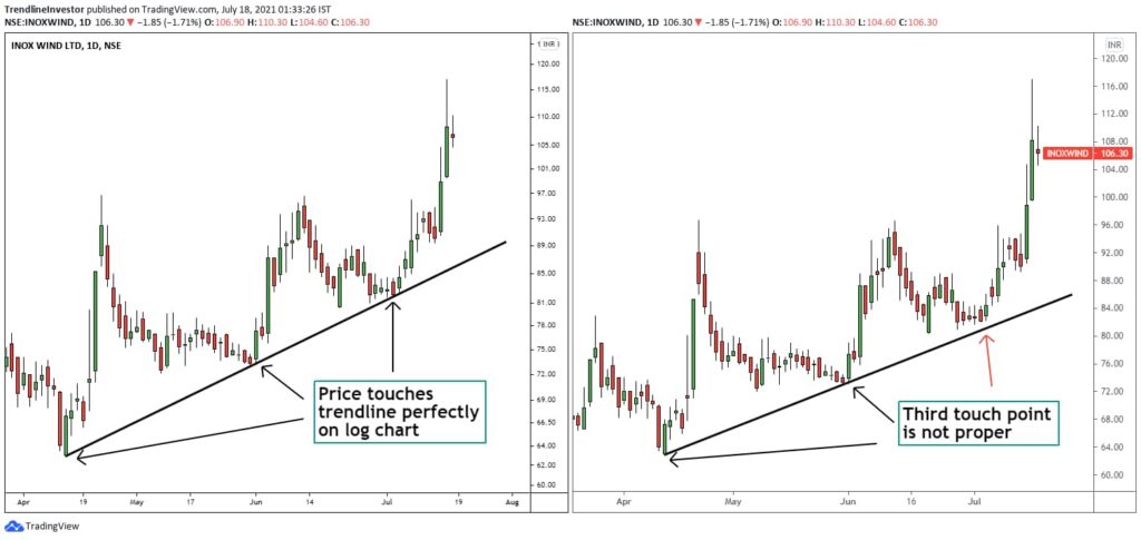
- On the logarithmic chart (left), the third touch lands precisely on the trendline because the vertical spacing is calibrated to percentage change; equal percentage moves occupy equal vertical distance.
- On the linear (arithmetic) chart (right), that same third point does not sit on the line; this scale measures changes in absolute price units, so as price rises, the same percentage increase translates into a larger dollar move, and the trend’s slope appears steeper.
The same trendline that shows three clean touches on a logarithmic chart will look invalid on a linear scale. This is the practical distinction between logarithmic and linear charts when drawing trendlines in technical analysis.
Are price action signals different on logarithmic vs linear (arithmetic) charts?
Yes. There is a clear and important difference in price action signals between these two scales. The image below shows a long-term chart of Apple Inc. (Apple) illustrating this point vividly:
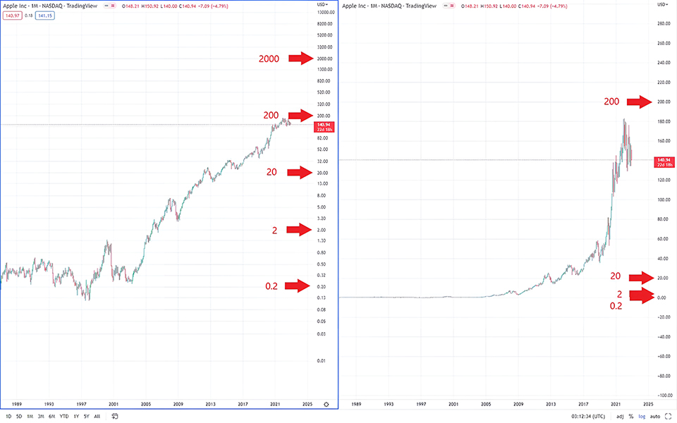
On the Logarithmic Chart (left)
- Stable signals: The entire price history sits within a coherent, ascending channel. Price action signals such as pullbacks to channel support or tests of channel resistance are clearly visible and analyzable throughout the trend (from years ago up to the present).
- True candle proportions: The relative size of candlesticks reflects percentage volatility. As a result, a “large” move in 2005 is visually comparable to a “large” move in 2020, preserving its analytical significance.
On the Linear (Arithmetic) Chart (right)
- Misleading, washed-out signals: Earlier price history is compressed into an almost flat line. Price action cues, candlestick patterns, and swings prior to 2010 are effectively lost.
- Unrealistic trend depiction: The recent advance appears near-vertical and euphoric, which may mislead an analyst into concluding the stock is at the end of its uptrend. On the logarithmic chart, however, the same move is simply a normal fluctuation within the long-term channel.
How Does a Logarithmic Chart Affect the Accuracy of Fibonacci Level Analysis?
Yes, using a logarithmic chart can significantly improve the accuracy of analysis with Fibonacci tools, especially in long-term, high-volatility trends.
The reason is straightforward: Fibonacci tools operate on ratios and percentages, while a logarithmic chart displays price in percentage terms. This inherent alignment between the tool and the scale makes the resulting support and resistance levels more precise and reliable.
The image below presents a Fibonacci analysis applied to a long-term chart of the S&P 500 Index.
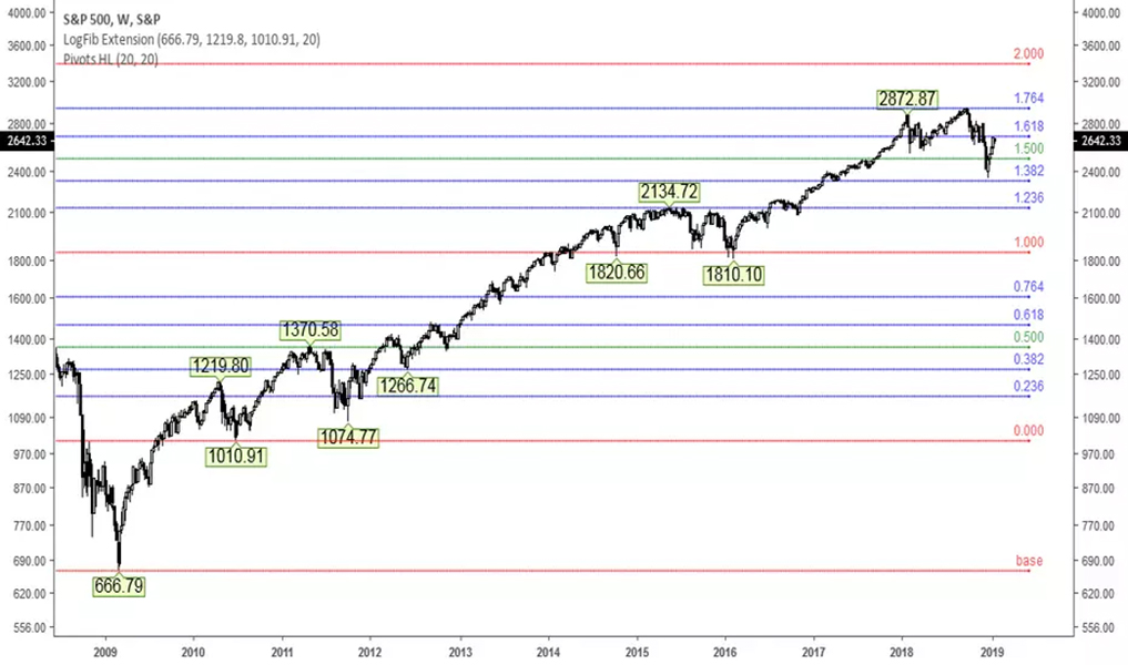
On this chart, which uses a logarithmic scale, a Fibonacci extension has been drawn based on the 2009 swing low and the initial up-leg that followed. As the chart shows, the market reacted precisely to these logarithmic levels for several years. For example, the 2015 peak formed exactly at the 1.000 extension, and the 2018 advance stalled after hitting the key 1.618 level (the golden ratio).
What if we used a linear (arithmetic) chart instead? Applying the same analysis on a linear chart, given the index’s multi-fold increase would push the upper Fibonacci levels (such as 1.618 and 2.000) much higher and space them unrealistically far apart, making price reactions to those levels far less precise.
A resistance breakout may appear on a linear chart but remain invalid on a logarithmic scale. This discrepancy in highly volatile markets can completely alter entry and exit strategies.
Differences in Price Patterns on Logarithmic vs. Linear (Arithmetic) Charts
The key distinction between logarithmic and linear (arithmetic) price charts is that a logarithmic chart preserves the true geometric structure and stability of a trend, whereas a linear chart can distort patterns by emphasizing absolute price moves. This often makes patterns appear misleading.
This difference matters most in long-term analysis and in markets that experience large, multi-fold advances such as cryptocurrencies and high-growth equities.
Why a Logarithmic Chart Is Essential for Analyzing Percentage Changes and Long-Term Moves
The answer is straightforward: people naturally think in percentage terms.
A $10 move in a $1,000 stock (1%) feels insignificant, while the same $10 move in a $20 stock (50%) is highly consequential. A linear chart ignores this psychological and economic reality by treating all $10 moves as visually equal.
Because investment logic is fundamentally based on percentage returns (and the effects of compounding), a logarithmic chart provides a more faithful picture of an asset’s performance. For multi-year horizons, using a log scale is typically the best and most rational approach for technical analysis.
Conclusion
There is no single, definitive answer to which chart type is “better.” Choosing intelligently between a logarithmic chart and a linear (arithmetic) chart depends on your objective, time frame, and the market context.
As a rule of thumb:
- A linear (arithmetic) chart is a simple, effective tool for short-term trading and for examining fluctuations within a narrow price range.
- A logarithmic chart is essential for analyzing long-term trends, gaining a realistic view of percentage-based growth, and handling high-volatility markets.
By switching to a log scale, you avoid the distortions introduced by a linear scale and achieve greater precision when working with trendlines, price patterns, and Fibonacci levels. A professional analyst should be fluent with both scales and know when to toggle between them to obtain the most complete picture of market behavior. Ultimately, that skill will shape the quality of your trading decisions.