
icon icon Home
icon icon Accounts
icon icon Quick start
icon icon Symbols

The Nadaraya-Watson Envelope: Kernel Regression, Settings, Repainting, and Honest Use

Author
Abe Cofnas
Abe Cofnas
calendar Last update: 29 August 2026
watch Reading time: 10 min

The Nadaraya-Watson envelope is a technical indicator that draws a smooth line through price using kernel regression, then places an upper and a lower band around it to form an envelope. Traders use the centreline to read the trend and the bands to spot stretched prices, treating a touch of either edge as a possible reversal area. It was popularised on TradingView by LuxAlgo and has since been ported to MetaTrader and other platforms.

What makes it different from the bands most traders already know is the middle. Bollinger Bands sit around a simple moving average and Keltner Bands around an exponential one, while this indicator uses a statistical smoother borrowed from non-parametric regression. The result hugs the trend more closely and looks strikingly clean, which is exactly why it needs to be understood before it is trusted.

This guide explains the maths in plain language, walks through every setting, and deals directly with the repainting issue that makes the indicator look far better in hindsight than it behaves live. It also repeats what the publisher itself says about the tool, which is more candid than most indicator marketing.

bookmark
Key Takeaways
  • The Nadaraya-Watson envelope smooths price with kernel regression, then adds bands set by mean absolute deviation times a multiplier.
  • Kernel regression is a weighted average in which nearby bars count for more, which is what makes the line smooth and low-lag.
  • The defaults in the original script are bandwidth 8, multiplier 3, source close, calculated over the most recent 500 bars.
  • By default the indicator repaints: past values are recalculated as new bars arrive, so historical signals may never have existed live.
  • LuxAlgo states plainly that it does not recommend the method alone or purely in real time, and has no data showing it beats classic bands.

What Is the Nadaraya-Watson Envelope?

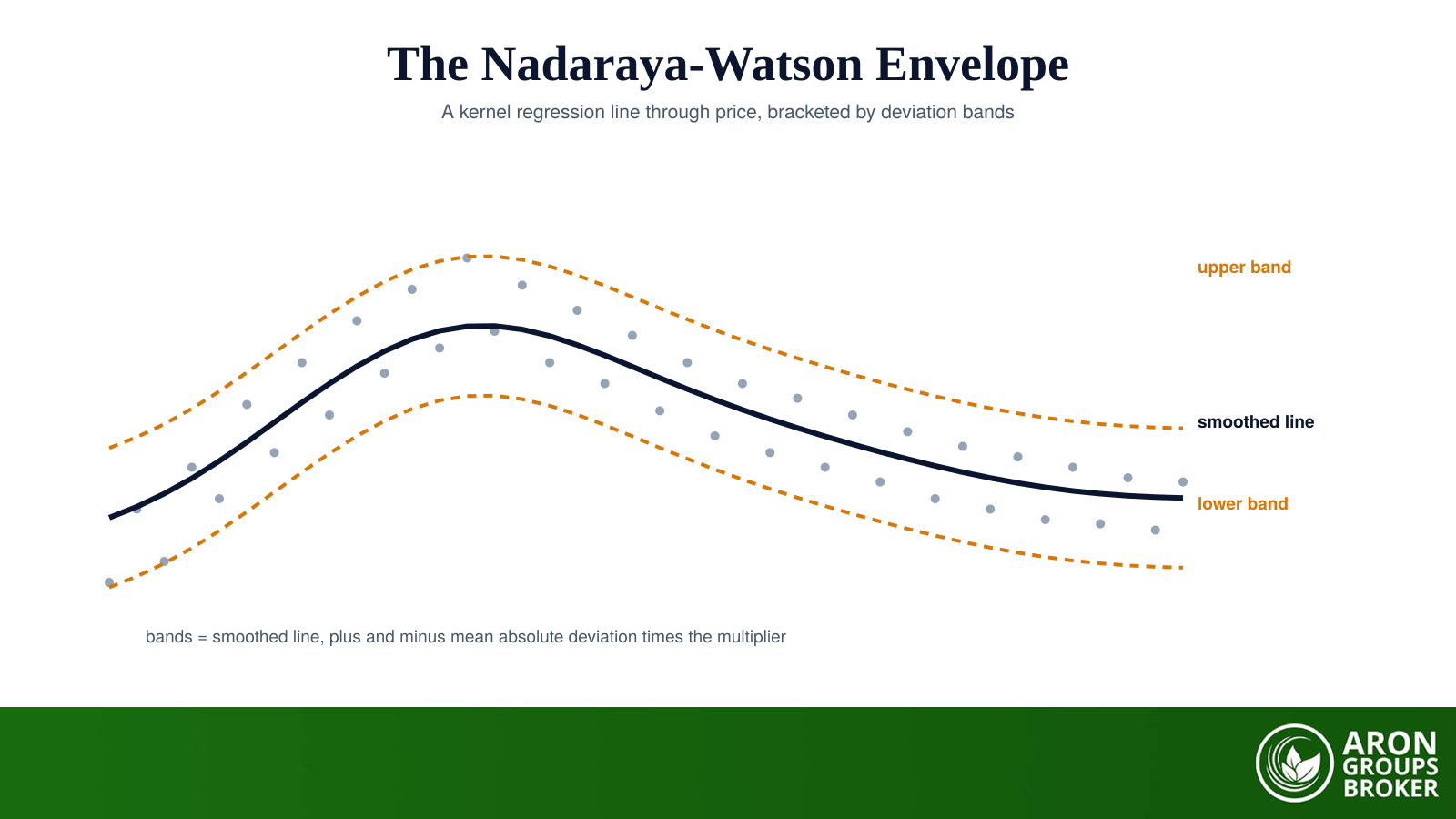
The indicator has two parts. First it estimates the underlying trend in price using the Nadaraya-Watson estimator, a kernel regression method that produces a smooth curve rather than a stepped average. Then it measures how far price typically strays from that curve, using the mean absolute deviation, and offsets the curve up and down by a multiple of that figure. The result is a channel that widens when price is volatile and narrows when it is calm, drawn around a centreline that bends with the market instead of dragging behind it.

sms-star

Risk Disclosure
Trading forex and CFDs carries a high level of risk and can result in the loss of all your capital. This content is educational and is not investment advice. Never risk money you cannot afford to lose.
Where the Maths Comes From

The estimator is not a trading invention. Elizbar Nadaraya and Geoffrey Watson published it independently in 1964, Nadaraya in Theory of Probability and Its Applications and Watson in Sankhya, and it became one of the foundational tools of non-parametric statistics. Its job is to estimate the expected value of one variable given another without assuming the relationship has any particular shape. Applied to a chart, the two variables are simply time and price. Sixty years of statistical use is a reasonable pedigree, though it says nothing about profitability.

Kernel Regression in Plain Terms

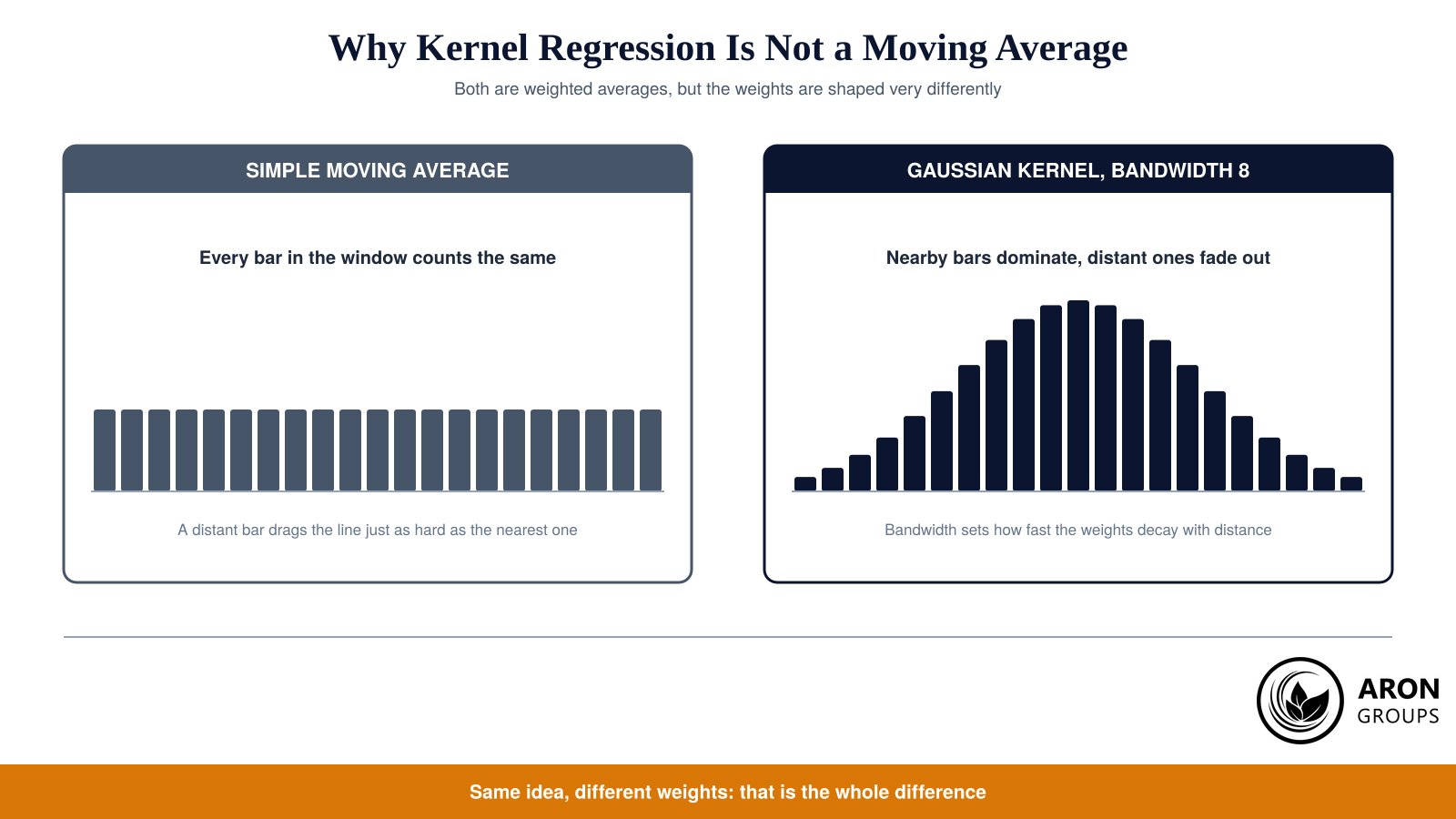
A simple moving average treats every bar in its window as equally important. The bar from twenty periods ago pulls on the line exactly as hard as yesterday’s, and the moment it drops out of the window it stops counting altogether. That abrupt in-or-out behaviour is what makes moving averages look stepped and react late to turns.

Both methods average the same prices, but a Gaussian kernel lets nearby bars dominate while distant ones fade smoothly to nothing.

Kernel regression replaces that hard window with a smooth weighting function. Each bar gets a weight based on how far away it is in time, calculated with a Gaussian kernel, so the nearest bars carry most of the influence and distant ones fade towards zero instead of vanishing at a cutoff. Every estimate is still just a weighted average, which is worth remembering when the language starts to sound advanced: this is careful smoothing, not prediction, and the same discipline that governs any quantitative investing tool applies here.

The payoff is a curve that turns earlier and looks cleaner than a moving average of similar responsiveness. The cost, as the next sections explain, is that the standard version gets part of that smoothness from bars on both sides of each point, including bars that had not printed yet when the signal supposedly appeared.

How the Envelope Is Built

Once the smoothed line exists, the bands follow in two steps. The indicator measures the absolute distance between each price and the estimated trend, then averages those distances to get the mean absolute deviation. That single number describes how far price normally wanders from the line. Multiplying it by the multiplier setting and adding it to the centreline gives the upper band; subtracting it gives the lower band.

sms-star

Rule
Upper band = smoothed line plus (mean absolute deviation multiplied by the multiplier). Lower band = smoothed line minus the same amount. The centreline reads the trend, the bands read the stretch.
The choice of mean absolute deviation rather than standard deviation is a small but meaningful difference from Bollinger Bands. Standard deviation squares the distances before averaging them, so a single violent bar inflates the bands sharply; mean absolute deviation treats that outlier proportionally, which produces edges that react more gradually to one-off spikes. Neither is correct in the abstract; they define unusual in slightly different ways.

The Settings and What Each One Changes

The original Pine Script exposes only four inputs, which is part of the appeal. Bandwidth controls smoothness, the multiplier controls width, source selects the price series, and a toggle decides whether history is allowed to change. The calculation runs over the most recent 500 bars, a script limit rather than a user setting, so the indicator always describes a rolling recent window.

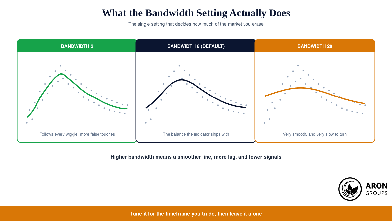
Bandwidth is the master setting: low values chase every wiggle, high values erase the wiggles and the turns with them.
SettingDefaultWhat it doesRaise it and
Bandwidth (h)8Controls how fast bar weights decay with distancethe line gets smoother and slower to turn
Multiplier (mult)3Scales the mean absolute deviation into band widththe bands widen and touches become rarer
SourceCloseThe price series being smoothedusing a typical price softens gaps and spikes
Repainting smoothingOnWhether history is recalculated as bars arriveturning it off gives the honest endpoint version

Table 1: The four inputs of the original Nadaraya-Watson envelope script and their defaults.

Bandwidth deserves most of your attention because it decides how much of the market you are choosing to ignore. At a low value the curve follows nearly every swing and the bands are touched constantly, generating noise that looks like signals. At a high value the line becomes elegant and almost useless for timing, because by the time it bends the move is over. The shipped value of 8 is a compromise reached on daily and intraday equity charts, not a law, and it is worth testing on the timeframe you actually trade before treating it as gospel.

The Repainting Problem

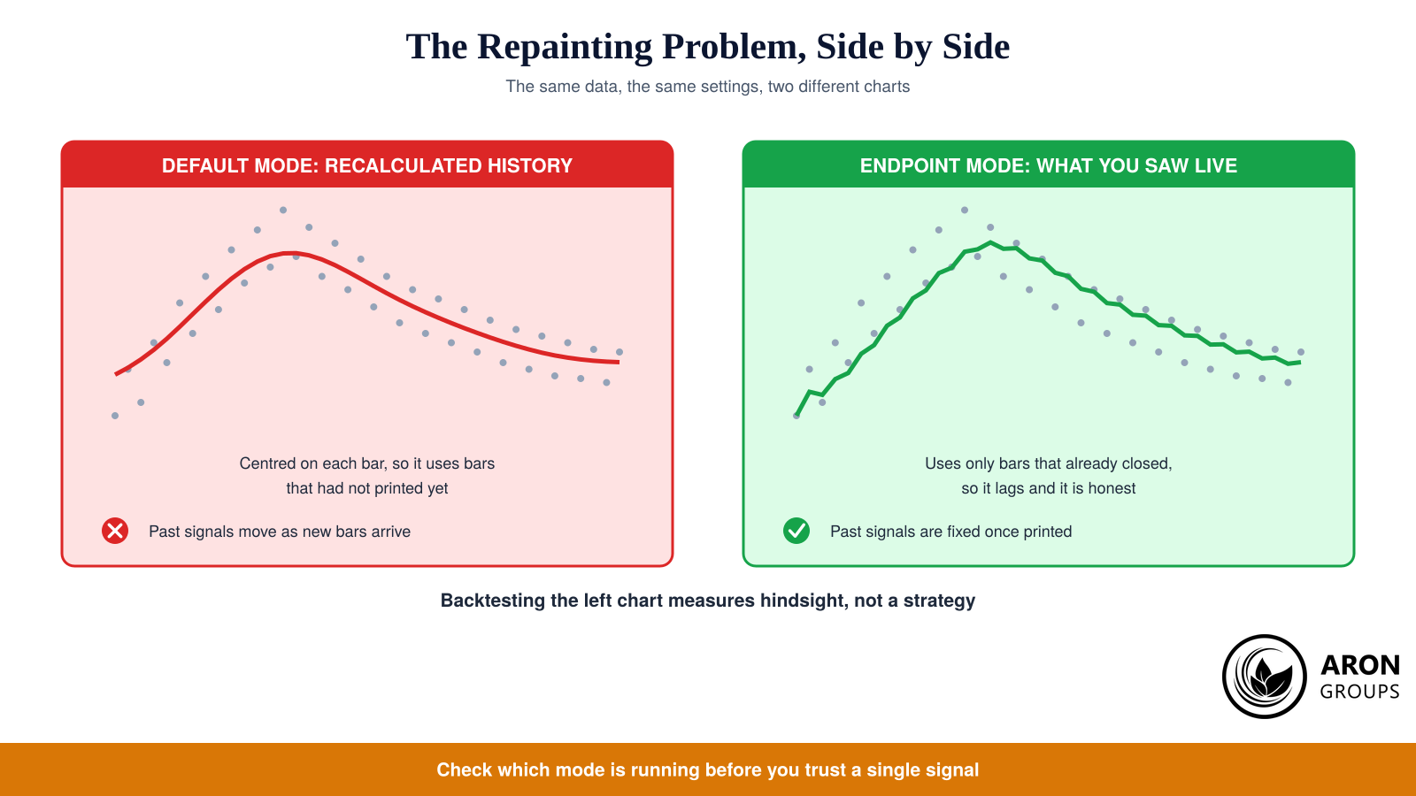
This is the part that matters more than every setting combined. In its default mode the indicator repaints, meaning the values it shows for past bars are recalculated as new bars arrive. The reason is structural rather than sinister: the classical Nadaraya-Watson estimator is centred, so the smoothed value at any bar is a weighted average of bars on both sides of it. Bars to the right of a historical point exist now, but they did not exist then.

The same prices and settings in both modes: the default curve is centred on each bar, while the endpoint version uses only bars that had already closed.

The consequence is that a chart full of perfect band touches at exact turning points is not evidence of anything. Those marks were placed with information that arrived afterwards. Scrolling back through history, or worse, running a naive backtest on the repainting version, measures hindsight rather than a strategy, and the equity curve it produces will not survive contact with live data.

The fix is built in. Switching the repainting option off produces what is usually called the endpoint Nadaraya-Watson estimator, which uses only bars that have already closed and therefore behaves like a conventional causal moving average: it lags, and its history stays put. That version is the only one worth taking into out-of-sample backtesting, and it is the only one whose signals you could actually have taken in real time.

sms-star

Rule
Before you judge this indicator, check which mode is running. Repainting on means the chart is showing you a reconstruction of the past, not a record of what it said at the time.

Mini Example: Why a Repainted Chart Flatters Itself

Load the default settings on any pair and scroll back six months. Almost every significant swing high sits neatly against the upper band and every low touches the lower one, which looks like a system with remarkable timing. The temptation is to conclude that fading the bands works.

Now switch the repainting toggle off and look again. The centreline shifts, the bands move, and a large share of those perfect touches either disappear or arrive one or more bars late. Nothing about the market changed between the two charts. The only difference is whether the indicator was allowed to use bars that had not printed yet, and that difference is the entire gap between an impressive screenshot and a tradeable rule.

What the Publisher Itself Says

Indicator descriptions rarely undersell their product, which makes LuxAlgo’s own note worth quoting in substance. In the published script the authors state that they do not recommend this precise method being used alone or solely for real-time applications, and that they hold no data supporting its performance over more classical bands, envelopes or channel indicators. They also warn in the settings tooltip that the default configuration is subject to repainting.

That is an unusually honest disclaimer, and it reframes the tool correctly: a visualisation aid built on a respected statistical method, not a claim of edge. Any course or signal service selling the envelope as a high-accuracy system is making a claim its authors declined to make.

How to Use It Sensibly

Used as context rather than as a trigger, the envelope earns its place. The slope of the centreline is a clean trend filter: when it rises, look for longs and treat lower-band touches as pullbacks into the trend rather than reversal signals. Band touches themselves are best read as a statement that price is currently stretched relative to its recent path, which is information, not instruction. Confirmation from structure, momentum or volume turns that information into something closer to a trading edge.

The failure mode is predictable and expensive. Fading the upper band repeatedly in a strong uptrend means selling into strength every day until the account cannot take another one, which is why regime matters more than the setting: mean reversion tools work in ranges and bleed in trends. Position sizing and a defined invalidation level, not the indicator, are what keep that bleed survivable, and studies of active day trading have long found that most participants lose money regardless of the tools on their screen.

Can the envelope be traded mechanically?
Only in the endpoint mode, and only after testing. A mechanical rule on the repainting version cannot be validated because its own history changes, so any result is meaningless. Even in endpoint mode the signal is a band touch, which is common enough that costs and slippage dominate the outcome unless a filter reduces the frequency substantially.

How It Compares with Bollinger, Keltner and Donchian

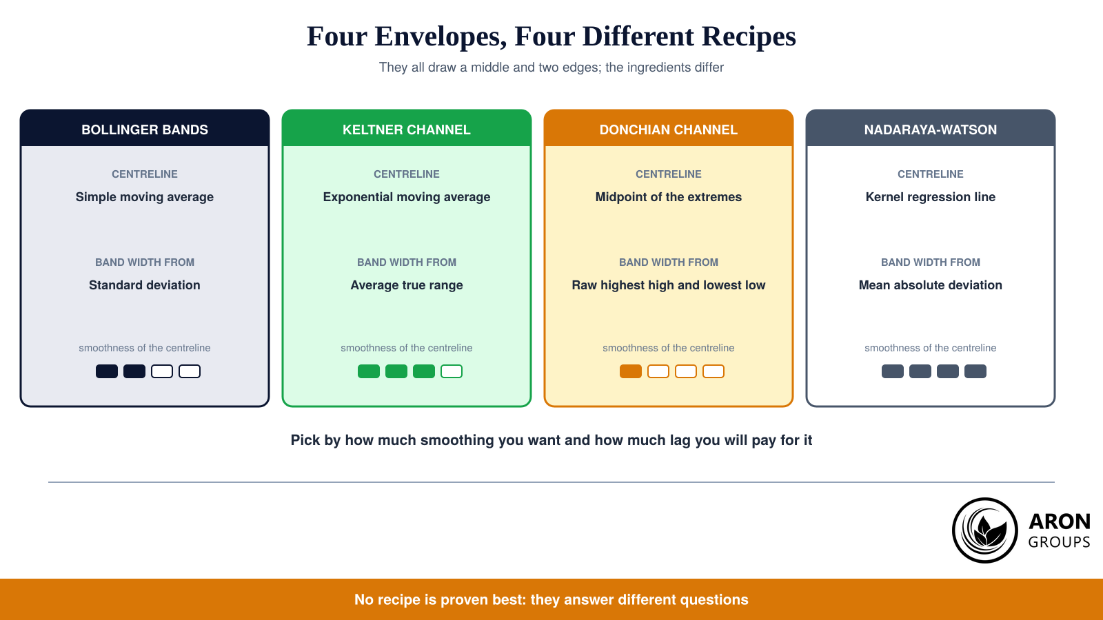
Every envelope indicator answers the same two questions in a different way: where is the middle of the market, and how far from it counts as far. Seeing the four common answers side by side makes the choice much simpler than the marketing around any one of them suggests.

Four envelopes, four recipes: the centreline and the width formula are what actually distinguish them.
IndicatorCentrelineBand width fromBest suited to
Bollinger BandsSimple moving averageStandard deviationVolatility expansion and squeeze reading
Keltner ChannelExponential moving averageAverage true rangeTrend following with steadier edges
Donchian ChannelMidpoint of recent extremesHighest high and lowest lowBreakout systems and turtle-style rules
Nadaraya-WatsonKernel regression lineMean absolute deviationSmoothed trend reading and stretch context

Table 2: The four common envelopes compared by centreline and width formula.

The honest summary is that the Nadaraya-Watson envelope buys a smoother centreline and pays for it either in lag, in the endpoint version, or in repainting, in the default one. Bollinger and Keltner Bands have no such trade-off because they were causal from the start. If you are switching because the kernel version looks better on a historical chart, that is precisely the reason not to, and Monte Carlo stress-testing will make the point faster than argument.

Honest Limits

Three limits should stay in view. The indicator is a smoothing and visualisation tool rather than a system, so it produces context and not entries. Its default mode misleads backtests in a way that flatters the user, a rare and dangerous combination. And no published evidence shows it outperforms far simpler bands, so adopting it is a preference about how charts look rather than an upgrade in expectancy. Sound risk management does more than any centreline formula.

The deeper caution is statistical. Smoothers by construction fit the data they are shown, and the smoother the curve, the more convincing the fit will look in hindsight. That is why the measure that matters is the drawdown a rule produces forward, not how neatly the line traces history, and why no indicator setting protects against the risk of ruin that oversized positions create.

Where Aron Groups Fits

The envelope originated in Pine Script, but the ideas travel. Aron Groups runs MetaTrader 5, where kernel smoothers and band indicators can be added as custom indicators and tested on the same instruments you trade, from the majors to gold and indices. Market execution on ECN accounts means a band touch entry fills at the next available price rather than being requoted, which matters when several instruments hit their edges at once.

For evaluating any indicator honestly, cost control matters as much as charting. A demo evaluation lets you log a few hundred band touches without capital at risk, and the commission-free Nano account trades from 0.0001 lots when you move to live data. Retail forex and CFD trading carries a high risk of loss, as regulators consistently document, so build the sample before you build the size.

Conclusion

The Nadaraya-Watson envelope is a genuinely elegant piece of applied statistics: a sixty year old estimator drawing the smoothest reasonable line through noisy data and bracketing it with a sensible measure of dispersion. As a way of seeing trend and stretch at a glance it is a pleasure to use, and the short settings list makes it less fiddly than most modern indicators.

The discipline it demands is equally clear. Run the endpoint mode if you intend to trade it, treat band touches as context rather than commands, respect the regime you are in, and take the publisher’s own disclaimer at face value rather than the promises made by people selling courses about it. Do that, keep capital preservation ahead of chart aesthetics, and it becomes a useful lens instead of an expensive illusion, which is roughly the distinction that separates a professional trader from an indicator collector.

Frequently Asked Questions

Short answers to the questions traders ask most about this indicator.

Does the Nadaraya-Watson envelope repaint?

Yes, in its default configuration. The standard estimator is centred on each bar, so historical values are recalculated as new bars arrive and past signals can shift or disappear. Turning off the repainting smoothing option switches to the endpoint version, which uses only closed bars and keeps its history fixed at the cost of extra lag.

What are the best Nadaraya-Watson settings?

There is no universally best pair of values. The published defaults are a bandwidth of 8 and a multiplier of 3 on the close, which is a reasonable starting point. Lower the bandwidth for faster, noisier signals on short timeframes, raise it for a slower trend read, and adjust the multiplier until band touches are rare enough to be worth reacting to on your instrument.

How accurate is the Nadaraya-Watson indicator?

Any accuracy figure taken from a repainting chart is inflated, because the signals were placed using bars that had not yet printed. Measured properly in endpoint mode, it behaves like other mean-reversion band tools: reasonable in ranging conditions, poor when faded against a strong trend. Its own publisher reports no data showing it beats classic bands.

Is it available on MetaTrader as well as TradingView?

Yes. The original script is Pine Script for TradingView, and LuxAlgo distributes versions for MetaTrader 4 and 5 and NinjaTrader, while independent developers have written their own ports for several platforms. Check any third-party version carefully, since ports differ in whether they implement the repainting mode, the endpoint mode, or a modified band formula.

Continue Reading
not-found
calendar 29 August 2026
Rate this article

Leave a Reply

Your email address will not be published. Required fields are marked *

No thanks