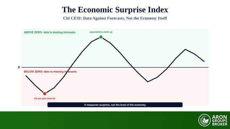

The Economic Surprise Index measures how economic data is arriving relative to consensus forecasts. A reading above zero means releases have on balance been beating expectations; a reading below zero means they have been missing. The best-known version is the Citigroup Economic Surprise Index, usually shortened to CESI, and it was built specifically for currency trading rather than for economic commentary.
That last detail is the key to using it properly, and the single most common mistake is to forget it. The index says nothing about whether an economy is strong or weak. It says whether forecasters were too optimistic or too pessimistic. A booming economy can print a falling index and a struggling one can print a rising index, and both readings are correct. Understood that way, it is a useful sentiment and data-momentum gauge and a legitimate input to a trading edge; misread as an economic scorecard, it will mislead you consistently.
Below: how the index is constructed, why surprise is not the same as level, the mean-reversion mechanism that makes strongly positive readings statistically fragile, why direction matters more than the number, the link to currencies and yields, cross-region comparison, and honest limits.
- The index measures data against consensus forecasts, not the level of economic activity: above zero is beating, below zero is missing.
- Citi builds it from weighted standard deviations of surprises against Bloomberg survey medians, on a rolling three-month window, with a time decay.
- Weights come from how much each release moves spot currencies, which is why it was designed for FX rather than for macro analysis.
- It mean-reverts because forecasters raise the bar after repeated beats and lower it after misses, so the surprise runs out on its own.
- Read the direction of surprises rather than a single print: a strongly positive index that is flattening is weaker news than a stable mildly negative one.
What Is the Economic Surprise Index?
Every scheduled release arrives with a consensus attached: the median forecast from a survey of economists. The difference between the actual number and that forecast is the surprise, and it is the surprise rather than the number itself that usually moves markets, because the forecast was already in the price. A surprise index aggregates those individual differences across many releases into one series so you can see, at a glance, whether an economy has been out-performing or under-performing what the market expected of it.
Risk Disclosure
CFDs are complex instruments and come with a high risk of losing money rapidly due to leverage. You should consider whether you understand how CFDs work and whether you can afford to take the high risk of losing your money. Past performance is not indicative of future results. This content is provided for educational purposes only and does not constitute investment advice.
Why Citi Built It
The CESI was developed by Citigroup as a currency tool, and that origin shapes everything about it. Its weights are derived from how much each release actually moves spot currencies, so the components that matter most are the ones a currency trader would already be watching. Given that foreign exchange is the largest market in the world by turnover, as the BIS triennial survey documents, having a single daily number that summarises the data flow behind a currency is genuinely useful, which is why the index escaped the trading desk and became a standard chart in macro commentary.
How the Index Is Built
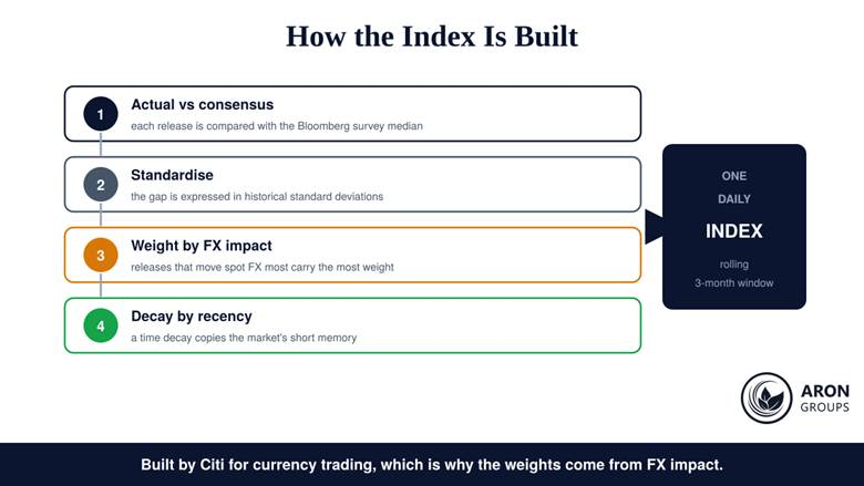
The construction is more careful than the simple beat-or-miss framing suggests, and four steps describe it. Each release is compared with the Bloomberg survey median. The gap is standardised, expressed in historical standard deviations so that a large miss on a volatile series is not confused with a large miss on a stable one. Each standardised surprise is then weighted according to how much that release typically moves spot currencies. Finally a time decay is applied, so recent surprises count for more than older ones, deliberately mimicking the market’s short memory. The result is calculated daily on a rolling three-month window.
Four steps from a single data release to one daily number, with FX impact deciding the weights.
Q: Is the Bloomberg surprise index the same thing?
A: No, and this matters when you compare charts. Bloomberg and Refinitiv publish their own surprise measures with different components, weightings, and windows, so two providers can show different levels and even different turning points for the same economy. Pick one series and stay with it rather than switching to whichever supports your view.
The Trap: Surprise Is Not the Level
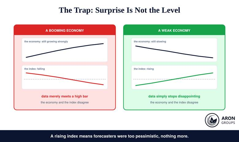
This is the insight that separates useful readings from misleading ones. Imagine an economy growing strongly for two straight quarters. Forecasters notice, revise their expectations upward, and the next batch of releases merely matches those higher forecasts. The surprise index falls, sometimes sharply, while the economy is still expanding at pace. Now imagine the mirror case: a weak economy whose data stops deteriorating faster than expected. The index rises while activity is still contracting.
Two economies, two indices moving the wrong way: the index tracks expectations, not output.
| Reading | What it does mean | What it does not mean |
|---|---|---|
| Strongly positive | Data has been beating forecasts recently | That the economy is strong in absolute terms |
| Strongly negative | Data has been missing forecasts recently | That a recession is underway |
| Rising from a low base | Forecasters were too pessimistic and are catching up | That growth has turned a corner |
| Falling from a high base | Expectations have caught up with reality | That activity is deteriorating |
| Near zero | Data is roughly matching consensus | That nothing important is happening |
The right-hand column is where most misreadings live; the index has no opinion about output.
Why It Mean-Reverts
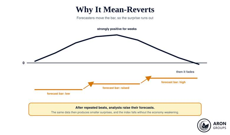
The index oscillates around zero for a structural reason, not a statistical accident. Forecasting is adaptive: after a run of upside surprises, economists raise their estimates, which raises the bar the next release must clear. The same underlying strength then produces a smaller surprise, and eventually none at all. The mechanism runs in reverse after a run of misses, when forecasts are cut until the data can clear them again. The practical implication is worth stating plainly: an index that has been strongly positive for many weeks is more likely to weaken next than to keep climbing, and that says nothing about the economy. It is a property of the measurement, and a good reason to test any rule built on it through out-of-sample backtesting before trusting it.
The bar rises with every beat, so the surprise runs out even when the data does not.
Rule
Treat extreme readings as information about positioning rather than about growth. When an index sits near a multi-month high, the market has already been repeatedly pleasantly surprised, which means expectations are now demanding. That is a setup for disappointment, not a forecast of one.
Read the Direction, Not the Dot
Because the level is a rolling aggregate, its slope carries more information than its value. An index at plus sixty and falling for three weeks describes a data flow that is losing momentum; an index at minus ten and rising steadily describes one that is gaining it. The second is the more encouraging picture even though the first has the higher number. If you take only one habit from this article, make it this: look at where the line has been going, then at where it is.
There is a simple way to make the slope explicit rather than eyeballing it. Note the reading once a week and keep four values: if the latest is below the average of the previous three, momentum in the surprises is deteriorating regardless of whether the number is still positive. That crude filter removes most of the temptation to read a single high print as good news, and it is the kind of rule a systematic process can actually record and review.
Why It Matters for Currencies
The transmission runs through policy expectations. Data arriving stronger than forecast raises the market’s expectation of tighter monetary policy, which tends to lift both that country’s bond yields and its currency, and the reverse holds for persistent misses. That is why a rising US surprise index often coincides with a firmer dollar and higher Treasury yields, and why Citi’s weights were built from currency impact in the first place. For a trader the practical use is as bias and context: it helps you decide which side of a pair deserves the benefit of the doubt, while entries, stops, and size still come from structure and from disciplined position sizing.
Mini Example: A Bias, Not a Signal
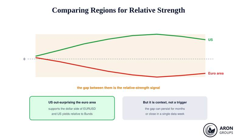
The US surprise index has climbed steadily for a month while the euro area’s has drifted lower. A trader reads this as the dollar having the better data momentum, so on dollar pairs they favour long dollar setups and require more evidence before taking the other side.
That is the whole use of it. It does not tell them where to enter, where to place a stop, or how large to trade, and it will not save a position if the next payrolls report misses badly. The index chose which direction earns the benefit of the doubt; every other decision was still theirs.
Comparing Regions for Relative Strength
Since currencies trade in pairs, the more advanced use is comparative. Citi publishes indices for major economies and regions, so you can set the US series against the euro area or China and ask which economy is out-surprising the other. That relative reading maps onto pairs far better than either index alone: EURUSD cares about the gap between European and American data momentum, not about the absolute level of either. Volatility context from tools such as Keltner Bands can then tell you whether price has already moved to reflect the gap or is still lagging it.
The distance between two regional indices is the signal that maps onto a currency pair.
One caveat belongs with this technique. Consensus quality is not uniform across currencies. The US has deep, well-covered surveys with many contributors, so its surprises are well calibrated. Smaller G10 economies have thinner coverage, which makes their surprise readings noisier and their turning points less reliable. Comparing a deep index against a thin one is comparing measurements of different quality, and the conclusion deserves proportionally less weight.
Where to Find the Chart
Access is uneven, and it is worth knowing before you plan around it. The full Citi series sit on institutional terminals, while several data vendors and macro-chart sites publish versions or reconstructions for free with a delay. For most retail purposes a weekly look at a free chart is sufficient, because the index is a slow-moving context gauge rather than something you would act on intraday. What matters more than the source is consistency: use the same series each week so that the slope you are reading is genuinely comparable.
Honest Limits
Four limits keep this honest. It is a data-momentum and sentiment gauge, not a forecast of economic activity and not a standalone trade signal. It is cyclical by construction, so mean reversion will eventually pull any extreme reading back toward zero. It lags, because it can only aggregate releases that have already happened. And methodology differs by provider, so Citi, Bloomberg, and Refinitiv will not agree precisely. Use it alongside the economic calendar, positioning data, and price itself, and remember the backdrop that European regulators found the majority of retail accounts lose money on leveraged products, which no macro indicator changes. Regulators’ own advisories on currency trading are the better primer on execution risk.
Where Aron Groups Fits
Surprise indices are published by data vendors, some freely and much of it behind terminals, so treat the chart as an input you fetch weekly rather than a live feed. The execution side lives on the MetaTrader 5 platform, where the underlying releases that feed the index are the same events you already mark for volatility, and where a bias drawn from data momentum still has to survive a hard stop and a defined risk-to-reward ratio.
If macro bias is new to your process, run it on a demo account for a quarter and log whether it actually improved your selection, then carry it to a small account before it influences real size. The test is a steadier equity curve across many trades, judged the way a systematic trader judges any input.
Conclusion
The Economic Surprise Index answers one narrow question well: has the data been better or worse than the market expected lately? Citi’s version aggregates standardised surprises against survey medians, weights them by currency impact, decays them by recency, and prints one number daily on a rolling three-month window. Above zero is beating, below zero is missing, and neither says anything about whether the economy is doing well.
Use the slope more than the level, expect mean reversion at the extremes, compare regions when you trade pairs, and discount readings from thin consensus. Then treat the whole thing as bias and context inside a process that already has rules, because a professional trader lets sound risk management and capital preservation decide the size while indicators like this one only decide which way to lean.
Frequently Asked Questions
Quick answers to the questions traders ask most about the Citi Economic Surprise Index.
What is the Citi Economic Surprise Index?
It is a daily index measuring how economic releases are arriving against consensus forecasts. Citi builds it from weighted historical standard deviations of surprises, comparing actual data with Bloomberg survey medians on a rolling three-month window, with recent surprises weighted more heavily.
What does a positive CESI reading mean?
It means economic releases have on balance been beating forecasts over the recent window. It does not mean the economy is strong in absolute terms, only that forecasters had set the bar lower than reality delivered.
Why does the Economic Surprise Index mean-revert?
Because forecasters adapt. After repeated beats they raise their estimates, so the same data produces smaller surprises and the index falls; after repeated misses they cut estimates until the data can clear them again. The bar keeps moving, which pulls the index back toward zero.
How do traders use the CESI in forex?
Mainly as directional bias and context. Stronger-than-expected data lifts expectations of tighter policy, which tends to support the currency and its bond yields, so a rising index often aligns with a firmer currency. Comparing two regional indices gives a relative reading that maps onto a pair.