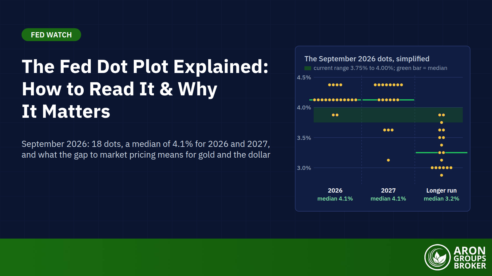

The Fed dot plot is a chart of where each Federal Open Market Committee (FOMC) participant thinks the federal funds rate should be in coming years. Each person places one anonymous dot per year-end, plus one for the longer run. The Fed publishes the chart quarterly in its Summary of Economic Projections (SEP).
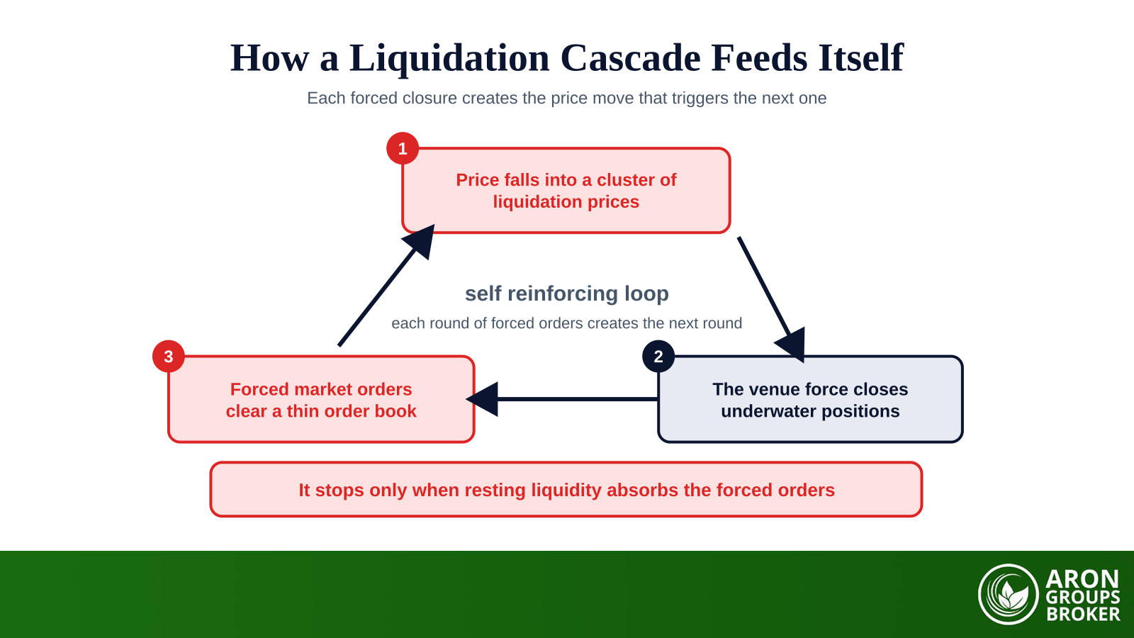
It matters now because the Fed is raising rates again. On 16 September 2026 the FOMC lifted the federal funds rate target range to 3.75% to 4.00%, its first increase since July 2023. The new dots showed 16 of 18 participants expecting at least one more hike this year. Spot gold fell 1.2% and the dollar index rose 0.6% that afternoon.
This guide explains who places the dots and how to read the median, the spread and the longer-run dot. It then compares the chart with market pricing and with what the Fed actually did.
- The dot plot shows each FOMC participant's view of the appropriate year-end federal funds rate: 19 people can submit a dot, but only 18 did in September 2026 because Chair Warsh declined.
- The September 2026 medians were 4.1% for 2026 and 2027, 3.9% for 2028, 3.6% for 2029 and 3.2% for the longer run, up from 3.8%, 3.6%, 3.4% and 3.1% in June.
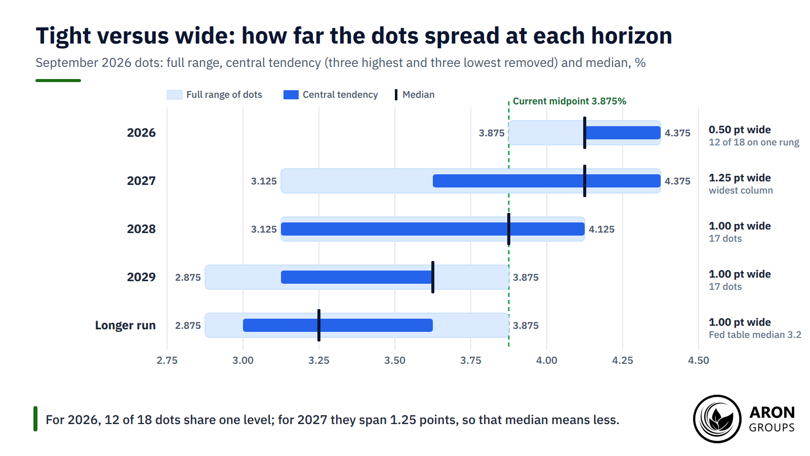
- The median is the market's reference point, but the spread matters: 12 of the 18 dots for 2026 sat on one level, while the 2027 dots spanned 1.25 percentage points.
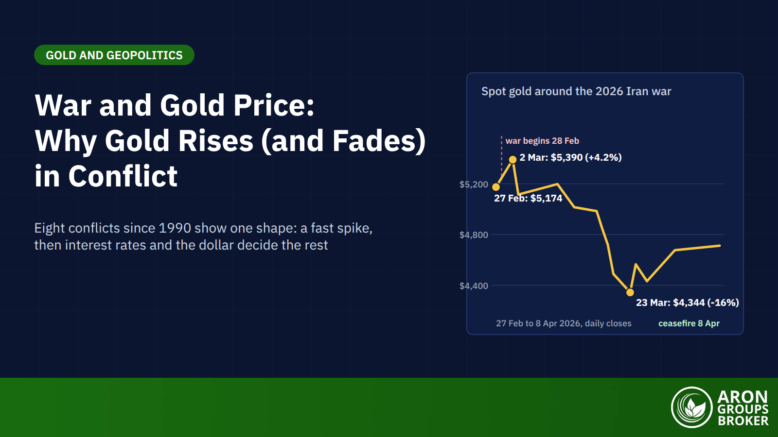
- Markets move on the surprise: on 16 September 2026 spot gold fell 1.2% to about $4,240 and the dollar index rose 0.61% to 100.28 after a hawkish set of dots.
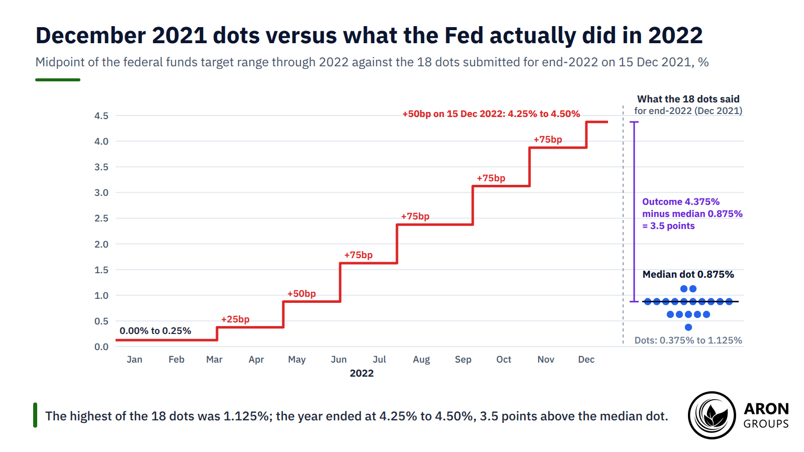
- The dots are projections, not commitments: the December 2021 median for 2022 was 0.9%, and the Fed ended 2022 at 4.25% to 4.50%.
What Is the Fed Dot Plot?
The Fed dot plot is the Fed’s own picture of where its policymakers think rates should go. Each FOMC participant writes down the federal funds rate they judge appropriate at the end of this year and of each of the next three years. They add a longer-run figure, and the Federal Reserve then plots every answer as a dot, without names.
Risk Disclosure
Trading forex and CFDs carries a high level of risk and can result in the loss of all your capital. This content is educational and is not investment advice. Never risk money you cannot afford to lose.
Who Places the Dots
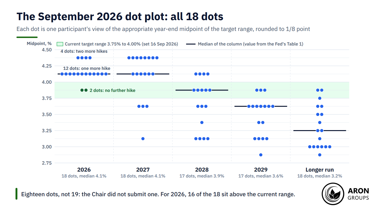
When every seat is filled, 19 people take part: the seven Federal Reserve Board governors and the 12 Reserve Bank presidents. All 19 can submit projections, although only 12 vote at any meeting. In September 2026 the chart carried 18 dots because Chair Kevin Warsh, in office since May 2026, declined to submit one for the second meeting running.
Each dot is rounded to the nearest 1/8 point, the midpoint of a quarter-point target range, so a dot at 4.125% means 4.00% to 4.25%. A dot is a judgement under one participant’s own forecast, not a promise and not a committee decision.
When the Dot Plot Is Released and How the Chart Is Built
The dot plot comes out four times a year, at the March, June, September and December FOMC meetings, alongside the 2:00 pm Eastern statement. The 2026 editions were dated 18 March, 17 June and 16 September; the next arrives on 9 December 2026. The October meeting has no projections.
The chart has a vertical axis for the rate, marked in 1/8-point steps, and a column for each year. September and December charts show four calendar years plus the longer run; March and June show three, because a new out-year is added every September.
A Short History
The Fed added the rate projections to its SEP on 25 January 2012, under Ben Bernanke, as a transparency measure. The SEP itself dates from November 2007. Medians followed in September 2015 and fan charts of past forecast errors in April 2017. A Fed communications committee is now reviewing whether the dots should continue.
How to Read the Fed Dot Plot: Median, Spread and the Longer Run
Reading the chart takes four steps: find the median, measure the spread, note the longer-run dot and compare everything with the previous release. The median only means something once you know how tightly the dots sit around it.
The Median Dot
The median is the middle dot in each column; with 18 dots it is the average of the ninth and tenth values. Markets treat it as the committee’s central path. In September 2026 the medians were 4.1% for 2026 and 2027, 3.9% for 2028, 3.6% for 2029 and 3.2% for the longer run.
The Fed computes table medians from unrounded submissions, while the dots are rounded to 1/8 point. That is why the longer-run dots centre on 3.25% while the table says 3.2%.
Mini Example: Counting the September 2026 Dots
Take the 2026 column. Two dots sit at 3.875%, the midpoint of the new 3.75% to 4.00% range, so two participants want no further move. Twelve sit at 4.125%, one quarter-point higher, and four sit at 4.375%, two quarter-points higher.
Sorted from the top, the first four values are 4.375% and the next twelve are 4.125%, so the ninth and tenth values are both 4.125%. The median is 4.125%, printed as 4.1%. That is exactly one more quarter-point hike by December from the current midpoint of 3.875%, and 16 of the 18 want at least that.
The Spread of the Dots
The spread, or dispersion, shows how far participants disagree. A tight cluster signals a shared view; a wide spread signals uncertainty, and its median deserves less weight. The Fed reports the full range of the dots and the central tendency, which drops the three highest and three lowest.
In September 2026 the 2026 dots spanned only 0.5 point, from 3.875% to 4.375%. The 2027 dots spanned 1.25 points, from 3.125% to 4.375%, with eight participants at the top and one at the bottom. The 2029 range ran a full point, from 2.875% to 3.875%.
The Longer-Run Dot and the Neutral Rate
The longer-run dot is where each participant expects the rate to settle at full employment, 2% inflation and no fresh shocks. Economists call this the neutral rate: r-star plus 2% inflation. It differs from the terminal rate, the peak of a hiking cycle.
That estimate has drifted up. The longer-run median sat at 2.5% for almost all of 2019 to 2023 and rose to 3.0% by December 2024. It reached 3.2% in September 2026. A higher neutral rate means 3.75% to 4.00% is less restrictive than it looks.
September 2026 Versus June 2026: What Shifted
The fourth step is to compare the new chart with the last one, because the change in the median is the message. A higher path than last time is hawkish; a lower path is dovish. Every median rose in September 2026, and the out-years rose most.
| Horizon | September 2026 median | June 2026 median | Change | September 2026 range |
|---|---|---|---|---|
| 2026 | 4.1% | 3.8% | +0.3 point | 3.9% to 4.4% |
| 2027 | 4.1% | 3.6% | +0.5 point | 3.1% to 4.4% |
| 2028 | 3.9% | 3.4% | +0.5 point | 3.1% to 4.1% |
| 2029 | 3.6% | Not yet projected | New column | 2.9% to 3.9% |
| Longer run | 3.2% | 3.1% | +0.1 point | 2.9% to 3.9% |
Federal funds rate medians and ranges from the Fed’s Summary of Economic Projections of 17 June and 16 September 2026.
The rest of the SEP explains the shift. The median projection for PCE inflation in 2026 rose to 3.7%, with core PCE at 3.4%. Participants now see inflation back at 2% only in 2029. The unemployment rate projection stayed at 4.1% and 2026 growth was marked up to 2.3%.
Key Point
Compare the median with two things: the previous release, which shows the Fed's own shift, and futures pricing, which shows the surprise. In September 2026 the Fed's shift was 0.5 point for 2027 and 2028; the market reaction told you how much of it was already priced.
Why Traders Care: Rates, the Dollar and Gold
The dots matter because the expected path of the policy rate, not the current rate, sets short-term Treasury yields, and those yields drive the dollar. A higher median path lifts the two-year yield, widens rate differentials against other currencies and tends to strengthen the dollar.
Higher yields also raise the opportunity cost of holding gold, which pays no interest. A hawkish surprise therefore usually sends gold down and the US dollar up together. The SEC’s investor site states that when market rates rise, prices of existing fixed-rate bonds fall. Its example has a $1,000 bond worth $925 after rates move from 3% to 4%.
What Happened on 16 September 2026
Spot gold traded up to $4,365.57 before the decision, then fell to $4,240.10 by 3:10 pm Eastern, down 1.2% on the day. Traders read the dots, and Chair Warsh’s remark that inflation is too high and has been for too long, as hawkish. December gold futures had already settled, up 1.3% at $4,387.50.
The dollar index (DXY) rose 0.61% to 100.28, its highest close since 31 July. The two-year Treasury yield rose 6.5 basis points to 4.72%, the 10-year closed at 5.003%, and the S&P 500 fell 0.44% to 7,552. The hike itself was 92% priced that morning, so the move came from the dots, not the quarter point.
How Traders Use the Dot Plot
Before the release, traders note what futures price and where a surprise would sit. During it, they trade the gap between the median and that pricing in smaller size. Prices jump at 2:00 pm and again at the 2:30 pm press conference. Afterwards, they watch whether the market drifts toward the dots.
Leverage cuts both ways on a Fed afternoon. A CFTC customer advisory notes that two out of three retail forex customers lose money and that high leverage amplifies both gains and losses. Gold moved almost 3% from high to low on 16 September 2026.
The Median Versus the Market
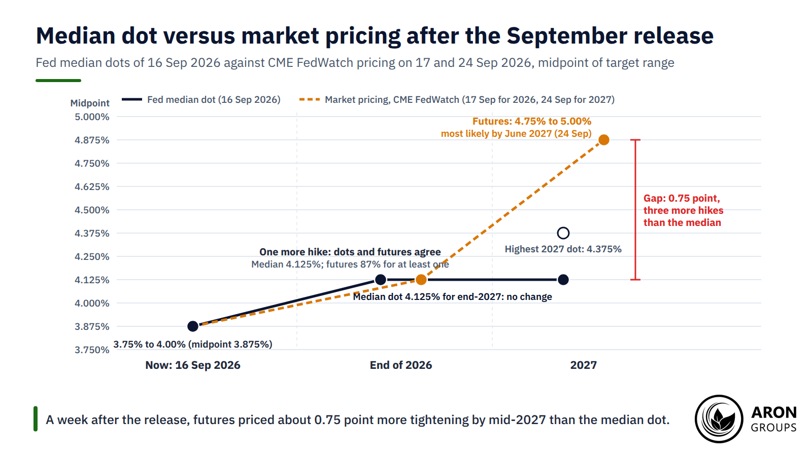
The dot plot is the Fed’s path; the market has its own, priced through fed funds futures and read off tools such as CME FedWatch. The gap between them is a signal. A market below the dots is betting the Fed will blink; a market above them is betting inflation will force the Fed’s hand.
September 2026 produced a clear example. For end-2026 the two agreed. The median dot implied one more hike; by 17 September futures priced an 87% chance of at least one and 35% odds of two. For 2027 they split. The median dot was 4.1%, meaning no further change. Yet by 24 September CME FedWatch showed 4.75% to 5.00% as the most likely range for June 2027, above every one of the 18 dots.
Research shows how the market digests a surprise. A September 2026 Chicago Fed Letter by D’Amico, King and Torralba measured the response to a median path 25 basis points above what Fed watchers expected. Market pricing rose only about 5 basis points on the day, then about 18 basis points over the next two quarters.
That slow repricing is what traders watch. On 1 October 2026 futures still priced one more hike this year and close to four by the end of 2027. The dollar index reached 102.10, its highest since April 2025, and the 10-year yield topped 5.30%, a 24-year high.
Q: If futures already price a different path, does the dot plot still matter?
A: Yes. The dots reveal the reaction function, meaning how the committee intends to respond to inflation and jobs data, and that is what markets reprice over the following months. The release-day move is the surprise against futures; the bigger move is the slow drift as traders decide whether the committee or the futures curve is right.
The Honest Limits of the Fed Dot Plot
The dot plot is a projection, not a promise. Every dot is conditional on one person’s forecast, and the Fed’s own uncertainty bands say how wide the error can be. The September 2026 SEP put the 70% band at plus or minus 0.5 point for 2026, 1.7 points for 2027 and 2.8 points for 2029. The bands come from forecast errors over 2006 to 2025, so a 2027 median of 4.1% comes with a band from roughly 2.4% to 5.8%.
The record bears that out. On 15 December 2021 the median dot for end-2022 was 0.9% and the highest 1.125%. The Fed then raised rates seven times in 2022 and finished the year at 4.25% to 4.50%. That was about 3.5 points above the median and more than 3 points above the most hawkish dot. The 2023 median from the same chart was 1.6%; that year ended at 5.25% to 5.50%.
The miss is not only history. In December 2025 the median for 2026 implied one cut. In March 2026 the highest of the 19 dots for this year was 3.625%, so no participant projected a hike. Six months later the Fed had hiked and the median was 4.1%. The dots are revised every quarter because the data change, which is also why the chart is a poor forecast two or more years out.
What the Chart Cannot Tell You
The dots are anonymous, so you cannot tie a dot to an official unless they say so. Minneapolis Fed President Neel Kashkari did exactly that on 1 October 2026, describing his own projection as one more hike this year and another in 2027. The chart shows year-end levels only, so it says nothing about timing, and the FOMC never votes on the median.
There is also a cost to the Fed. The BIS warned in March 2026 that market participants may focus on policy rate projections excessively. That reduces the information content of market prices, it said, and makes it hard for a central bank to deviate. With Fed communications under review, the chart itself could change in 2027. Treat it as a guide to bias, not a rate path.
Where Aron Groups Fits
Aron Groups does not offer futures or bonds, so you cannot trade the dots directly, but the markets that react to them trade on MetaTrader 5. Gold on XAU/USD and the major dollar pairs are where the September 2026 surprise showed up first, and the economic calendar lists every FOMC decision.
Fed afternoons are volatile, so size matters more than direction. A Nano account allows micro volumes from 0.0001 lots, which keeps the money at risk small while you learn how the release trades. A demo account lets you follow a decision day with no capital at risk. Spreads float, so expect them to widen at 2:00 pm Eastern on dot plot days.
Conclusion
The Fed dot plot is the clearest public record of where the FOMC’s participants think rates should go. The September 2026 edition said more hikes: a 4.1% median for 2026 and 2027, 3.2% in the longer run, and 16 of 18 dots above the target range.
Read it in order: median, spread, longer-run dot, then the change from the last chart and the gap to futures. The median gives the bias, the spread says how much to trust it, and the gap to the market shows where the surprise will come from.
Remember what it is not. The Fed missed its own 2022 path by 3.5 points, and the 2026 path flipped from a cut to two hikes within nine months. Its own error band for 2027 spans 3.4 points. Use the Fed dot plot as a guide to bias, and watch the next one on 9 December 2026.
Frequently Asked Questions
Short answers to common questions about the dot plot.
What is the Fed dot plot in simple terms?
It is a chart of where each Fed policymaker thinks the federal funds rate should be in coming years and in the longer run. Each participant gets one anonymous dot per year, and the median dot is the number markets quote.
When is the next Fed dot plot?
The next Summary of Economic Projections is due on 9 December 2026 at 2:00 pm Eastern; the October meeting has no projections. In 2027 the projection meetings end on 17 March, 9 June, 15 September and 8 December.
Is the dot plot a forecast of what the Fed will do?
No. Each dot shows what one participant judges appropriate under their own forecast, and the committee never votes on the chart. The December 2021 dots put end-2022 at 0.9%; the Fed finished 2022 at 4.25% to 4.50%.
Why does gold fall when the dot plot is hawkish?
A higher projected rate path lifts Treasury yields and the dollar, which raises the opportunity cost of holding gold, an asset that pays no interest. On 16 September 2026 spot gold fell 1.2% to about $4,240 within hours of a dot plot showing 16 of 18 participants wanting further hikes.