
icon icon Home
icon icon Accounts
icon icon Quick start
icon icon Symbols

Liquidation Heatmaps: How to Read Where Leveraged Positions Get Liquidated, and Why Price Chases Them

Author
Abe Cofnas
Abe Cofnas
calendar Last update: 12 October 2026
watch Reading time: 9 min

A liquidation heatmap is a chart that estimates the price levels where large clusters of leveraged crypto positions would be forcibly closed. Brighter colours mark bigger estimated clusters, so the map shows at a glance where forced selling or forced buying could concentrate. Traders use it mainly for Bitcoin and Ether futures, where leverage of 10x to 100x is common.

The stakes are high. On 10 October 2025, about $19 billion of positions were liquidated in under 24 hours, the largest one-day wipeout on record, as Bitcoin fell 14.5% within hours. Understanding where such clusters sit, and why they form, is the best defence against becoming part of the next one.

This guide explains how to read a liquidation heatmap, where its levels come from and why price is drawn towards clusters. It walks through two real cascades from 2025 and 2026, the main tools and the honest limits of the method. It also shows how an exchange liquidation differs from a stop-out on a CFD account.

bookmark
Key Takeaways
  • A liquidation heatmap estimates where leveraged positions would be liquidated; brighter bands mark larger estimated clusters.
  • Clusters above price are mostly short positions and clusters below are mostly longs; the map shows estimates, not real orders.
  • Higher leverage puts the liquidation price closer to entry: at 100x, a 0.5% move against a long is enough.
  • Dense clusters can act as magnets, because triggering them releases forced orders that speed the move, as in October 2025 and August 2026.
  • CoinGlass itself says actual liquidations are often lower than the colours imply, so use the map as a probability tool, not a signal.

What Is a Liquidation Heatmap?

A liquidation heatmap plots price on one axis and time on the other, and colours each price level by the estimated value of leveraged positions that would be liquidated there. Exchanges do not publish every trader’s liquidation price, so providers estimate them from market data such as trading volume and open interest, plus assumptions about how much leverage traders use.

sms-star

Risk Disclosure
Trading forex and CFDs carries a high level of risk and can result in the loss of all your capital. This content is educational and is not investment advice. Never risk money you cannot afford to lose.
Estimated Levels, Not Real Orders

This is the most important point to grasp. The bands are modelled, not observed, and CoinGlass describes its heatmap as predicting where liquidations might be triggered rather than how many will actually happen. Positions can be closed early, topped up with margin or cut by stop-losses, so real liquidations are often smaller than the colours suggest.

Heatmap Versus Liquidation Map

The two tools are often confused. A liquidation heatmap shows how estimated clusters build and fade over time. A liquidation map is a snapshot of estimated liquidation levels by price, usually drawn as bars for longs and shorts. Use the heatmap to see how clusters develop and the map to see which side is heavier right now.

Not the Same as an Order-Book Heatmap

Order-book heatmaps, sometimes called liquidity heatmaps, show real limit orders resting on one exchange’s book. Liquidation heatmaps show modelled forced orders spread across many traders’ positions. Both describe resting liquidity that price may seek out, but only the order-book version shows orders that actually exist.

How to Read a Liquidation Heatmap

Reading the map takes three checks: the colour, the side of price and the settings behind the picture.

Colour Intensity

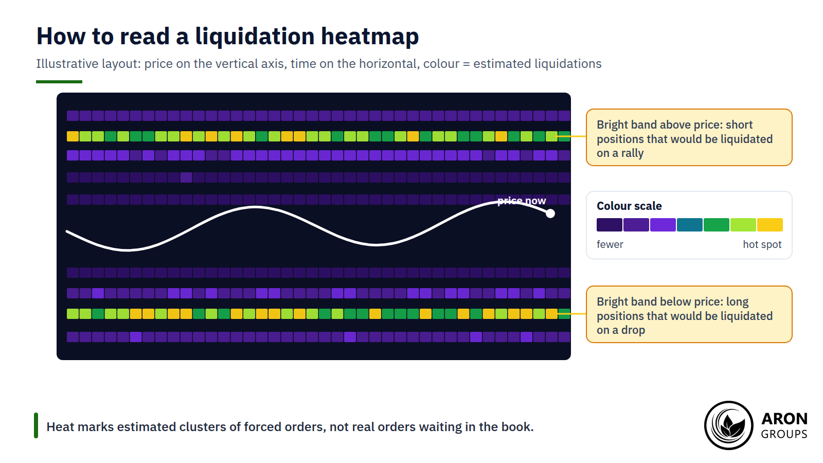
On CoinGlass, cooler purple shades mark few estimated liquidations and warmer shades up to yellow mark hot spots. The brighter the band, the larger the estimated pool of forced orders waiting at that level. Other providers, such as CoinAnk, use a black-to-yellow scale that works the same way.

Clusters Above and Below Price

Bands above the current price mostly represent short positions that would be liquidated if price rose, because liquidated shorts are forced to buy back. Bands below represent long positions that would be liquidated on a fall, because liquidated longs are forced to sell. The balance between the two tells you which side is more crowded.

Bright bands above price are mostly shorts that would be forced to buy; bright bands below are longs that would be forced to sell.

Look-Back Windows and Leverage Models

Most tools let you choose a look-back window, and CoinGlass offers ranges from 12 hours to one year. It also offers different models. Model 1 counts only high-leverage positions at 10x, 25x, 50x and 100x and suits short-term trading, while Model 2 counts all leverage and suits longer views. CoinGlass has not published a definition of its newer Model 3, so treat that output with extra care.

Reading an ETH or Altcoin Liquidation Heatmap

The same reading applies to Ether, which has its own heatmap on most tools. Ether’s derivatives market is smaller than Bitcoin’s, so a given wave of forced orders can move its price further, and altcoin maps are noisier still because volume and open interest are lower. With ETH at $2,711.52 on 23 September 2026, a 25x long would be liquidated near $2,616, less than 4% below.

Where the Levels Come From: The Liquidation-Price Maths

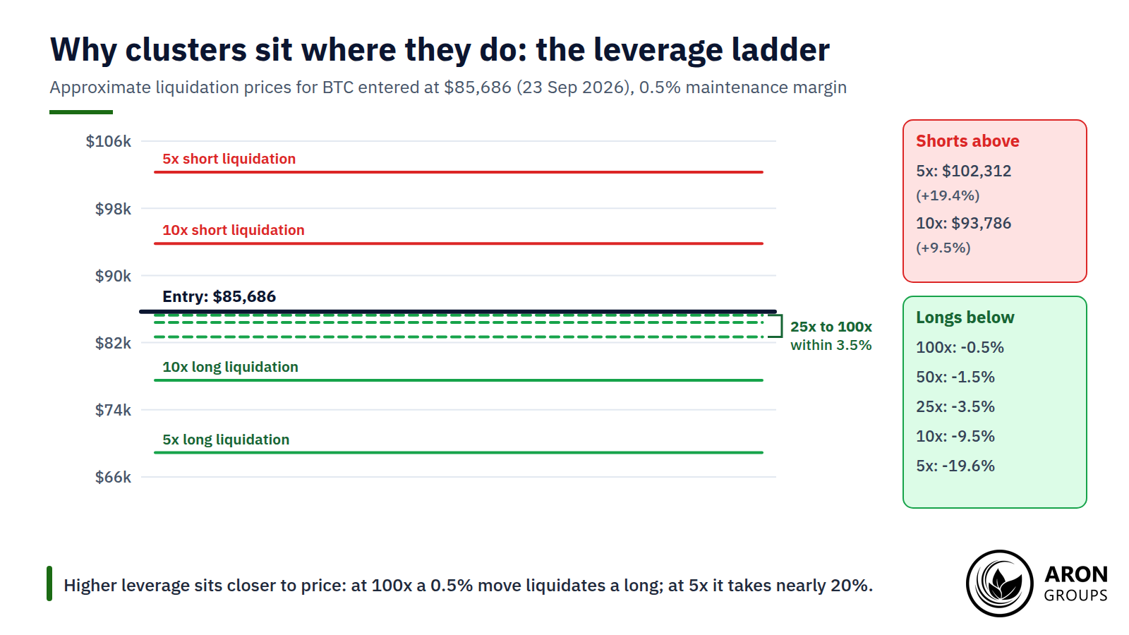
Every band starts with a simple calculation. For an isolated-margin position, the liquidation price is roughly the entry price multiplied by one minus one divided by the leverage, adjusted for the maintenance margin the exchange requires. Higher leverage leaves less room for price to move against you.

LeverageLong liquidates atMove against a longShort liquidates atMove against a short
5x$68,893-19.6%$102,312+19.4%
10x$77,505-9.5%$93,786+9.5%
25x$82,672-3.5%$88,670+3.5%
50x$84,394-1.5%$86,965+1.5%
100x$85,255-0.5%$86,112+0.5%

Approximate liquidation prices for Bitcoin entered at $85,686 on 23 September 2026, assuming a 0.5% maintenance margin and no fees or extra margin.

Real exchanges add fees, tiered maintenance margins and any extra margin you post, so their exact figures differ, but the pattern holds. Many traders use similar leverage from similar entry levels, so their liquidation prices bunch at similar distances from price, and that bunching is what the heatmap paints.

The higher the leverage, the closer the liquidation price sits to entry, which is why the brightest bands often hug the current price.

Mark Price, Insurance Funds and Auto-Deleveraging

Exchanges trigger liquidations off the mark price, a fair-value reference, rather than the last traded price, to reduce manipulation. When a position cannot be closed without a loss larger than its margin, the exchange’s insurance fund absorbs the shortfall. If the fund runs short in an extreme move, auto-deleveraging closes profitable positions on the other side, starting with the most profitable and most leveraged.

Why Price Is Drawn to Liquidation Clusters

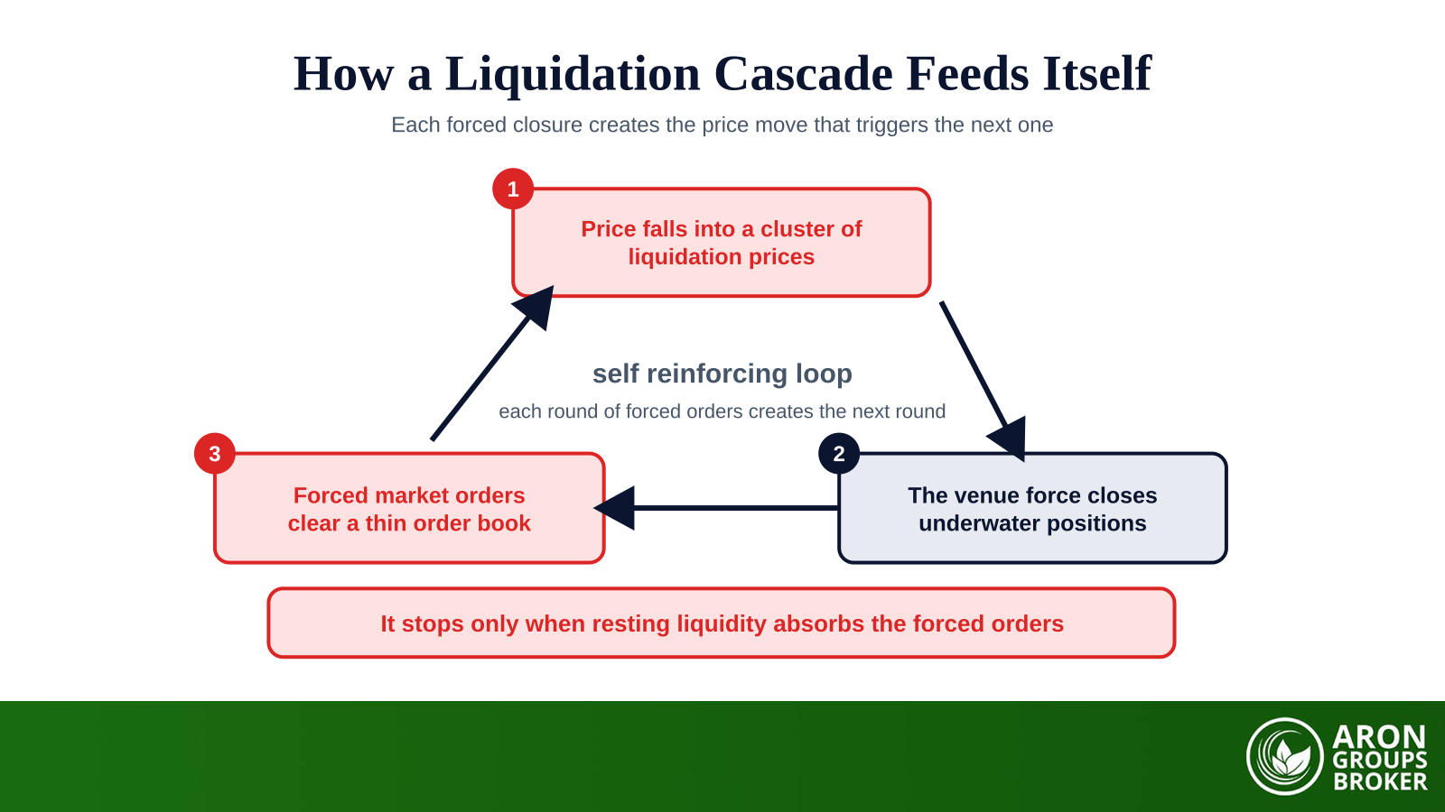
Large clusters work like magnets for a mechanical reason. When price reaches a dense band, liquidations become market orders: long liquidations sell and short liquidations buy. Those forced orders push price further in the same direction and trigger the next band, which is how a small move becomes a cascade. Traders call the hunt for these pools a liquidity grab or a stop hunt.

Research at the Bank for International Settlements links spikes in margin calls and liquidations during drawdowns to crypto’s frequent crashes, which is why the same pattern keeps repeating.

Open Interest and Funding: The Fuel Gauges

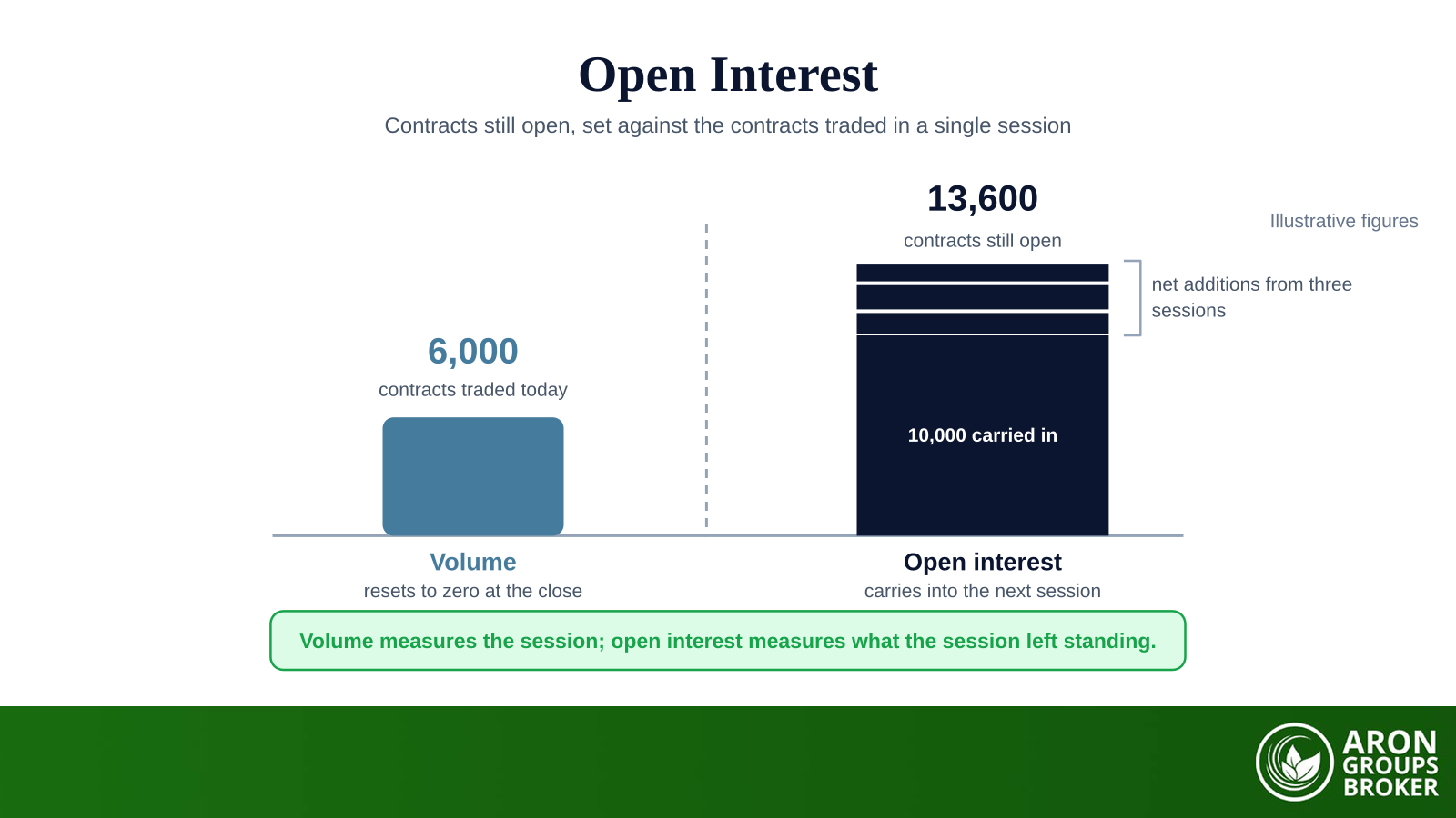
Two readings tell you how much fuel sits behind a cluster. Open interest measures how many futures contracts are open, so rising open interest means more leveraged positions that could be forced out. Funding rates show which side pays to hold perpetual futures, and when longs pay high funding, the market is crowded long and the bands below price deserve more attention.

Case Study: 10 October 2025, the $19 Billion Long Cascade

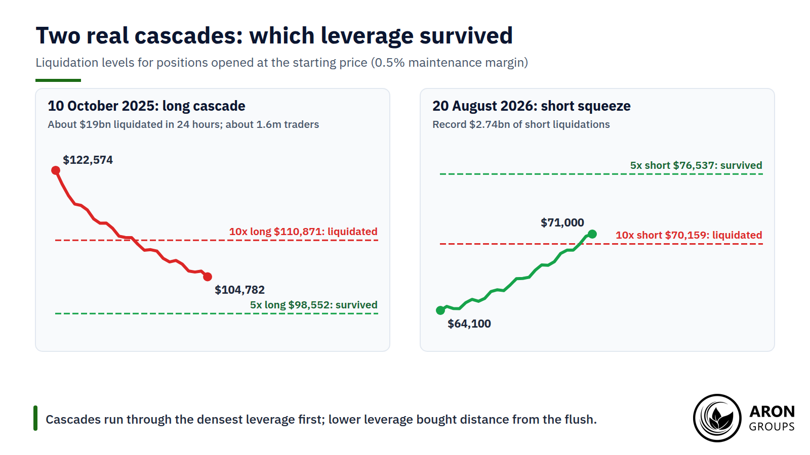
After a tariff threat against China late on Friday 10 October 2025, Bitcoin fell from $122,574 to $104,782 within hours, a 14.5% drop. About 1.6 million traders were liquidated, and roughly $3.2 billion was wiped out in the single minute starting at 21:15 UTC. Open interest in perpetual futures fell 43%, from $217 billion to $123 billion. The cascade unwound leverage built during the rally to Bitcoin’s record high of $126,198 on 6 October.

The maths shows why leverage decided who survived. A 10x long opened at the high would have been liquidated near $110,871, well above the low, while a 5x long would have survived with a liquidation price near $98,552. The $19 billion is also a notional figure; estimates of traders’ actual losses were a small fraction of it.

Case Study: 20 August 2026, a Record Short Squeeze

The mirror image came on 20 August 2026, when Bitcoin jumped from about $64,100 to above $71,000. A record $2.74 billion of short positions was liquidated, with more than $1 billion following the next day. A 10x short opened at $64,100 would have been liquidated near $70,159, while a 5x short, with a liquidation price near $76,537, survived the squeeze.

In both cascades the dense 10x level was swept while 5x positions survived: lower leverage bought distance from the flush.

The Main Liquidation Heatmap Tools

Several platforms publish liquidation estimates, and each makes different assumptions:

  • CoinGlass: the best-known heatmap and liquidation map, with look-back windows from 12 hours to a year and Models 1 to 3; API access requires a paid plan.
  • Hyblock Capital: liquidation levels for positions opened at 25x, 50x and 100x, plus a profile of levels that price has not yet reached.
  • CoinAnk: a heatmap on a black-to-yellow scale with windows from 12 hours to one month, which notes that it maps where positions open, not where they close.
  • The Kingfisher: liquidation maps across more than 27 exchanges, with a free tier and paid plans.

Because each provider uses its own model and exchange coverage, the same coin can show different clusters on different sites. Comparing two tools is a quick way to see which bands are robust and which are artefacts of one model. Check which exchanges each tool covers, too, because a cluster on one venue may not exist on another.

How to Use a Liquidation Heatmap in Practice

Used well, the heatmap adds a layer of context to price action and risk management. These four steps keep it in its place.

Step 1: Mark the Nearest Dense Clusters

Note the brightest bands above and below price in the timeframe you trade. Clusters close to price matter more for short-term moves, while distant ones matter for swing trades. A 24-hour window highlights short-term magnets, while a 30-day or 90-day window shows where larger, longer-held positions are exposed.

Step 2: Confirm With Open Interest, Funding and Structure

A cluster is more likely to be tested when open interest is rising and funding rates show one side crowded. Check whether the band lines up with obvious highs, lows or resting orders visible in the depth of market.

Step 3: Keep Stops Away From Obvious Clusters

A stop placed just beyond a bright band invites being swept with the crowd. Give the level room, reduce size so a wider stop keeps the same risk, or use structure-based stop-loss techniques instead of round numbers.

Step 4: Treat Clusters as Targets, Not Entries

A dense band is a plausible destination and a sensible place to take profit or expect volatility. On its own, it is not a reason to open a trade in its direction. Many traders scale out as price approaches a dense band, because the move often accelerates and then snaps back once the forced orders have been absorbed.

Q: If the heatmap shows a huge cluster below price, will price fall to it?
A: Not necessarily. The cluster estimates where forced selling would happen if price got there; it is not a forecast that it will. Strong buying, news or funding shifts can take price the other way, and bands often fade as traders cut leverage.

The Honest Limits of Liquidation Heatmaps

The heatmap is a useful map with a blurry legend. Its limits are worth stating plainly:

  • It is an estimate: exchanges do not publish liquidation ladders, so providers model them from volume, open interest and assumed leverage.
  • Actual liquidations are often lower than the colours imply, because positions are closed, hedged or topped up before price arrives.
  • Models differ and are not fully disclosed, as with CoinGlass’s Model 3, so two sites can disagree.
  • It says nothing about direction: a cluster below price is a risk zone, not a sell signal.
  • In very fast markets estimates can lag price, so the map is most useful before a move rather than during one.

Treat the heatmap as one tool alongside price structure, open interest and your own risk limits. US regulators have long warned that leverage in crypto futures magnifies losses, and high leverage is what creates the clusters in the first place.

Exchange Liquidation Versus a CFD Stop-Out

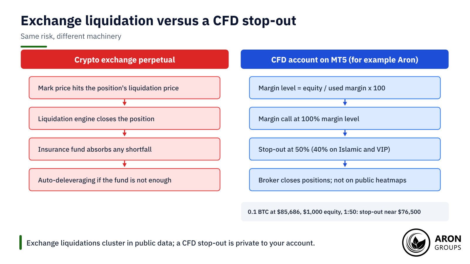
Liquidation heatmaps describe crypto exchange futures, where each leveraged position has its own liquidation price. A CFD account works differently. The broker monitors your whole account through the margin level, which is equity divided by used margin, and closes positions when it falls too far.

At Aron Groups, for example, a margin call arrives at a 100% margin level and a stop-out at 50%, or 40% on Islamic and VIP accounts. With $1,000 of equity and 0.1 BTC bought at $85,686 using 1:50 leverage, the stop-out would come near $76,500, roughly 10.7% lower, before spreads and costs.

Your stop-out is private to your account and does not appear on public heatmaps. Rules also differ by region: Europe’s securities regulator said in February 2026 that crypto perpetual futures can fall under its CFD rules, which cap retail crypto leverage at 2:1.

Exchange liquidations are per position and show up in public data; a CFD stop-out works at account level and stays private.

Where Aron Groups Fits

Aron Groups offers crypto CFDs such as BTCUSD and ETHUSD on MetaTrader 5 across its account types, with crypto leverage of up to 1:50 and lower leverage on larger positions. A heatmap can show you where exchange traders are crowded, even though your own position is managed through margin level rather than an exchange liquidation engine.

Before trading around a crowded level, use the margin calculator to see how much margin a position needs, and consider starting small on a Nano account. Crypto moves fast, which is exactly why cryptocurrencies are so volatile for leveraged traders.

Conclusion

A liquidation heatmap turns the leverage hidden in crypto futures into a picture: bright bands where forced orders would cluster, above and below price. Those bands can act as magnets, because triggering them releases orders that push price further, as the October 2025 and August 2026 cascades showed.

Read the map as a set of probabilities built on estimates. Combine it with open interest, funding and structure, keep stops away from obvious clusters and use leverage low enough that you never become part of the band. The traders who survive cascades are rarely the ones who predicted them; they are the ones who sized for them.

Frequently Asked Questions

Quick answers to common questions about liquidation heatmaps.

What does a liquidation heatmap show?

It shows estimated price levels where leveraged futures positions would be liquidated, coloured by the size of each cluster. Bright bands above price are mostly shorts, and bright bands below price are mostly longs.

Is the CoinGlass liquidation heatmap accurate?

It is a model, not a record of real orders. CoinGlass says actual liquidations are often lower than the colours imply, so use it to find zones of risk rather than exact prices.

What do the colours on a liquidation heatmap mean?

On CoinGlass, purple means few estimated liquidations and yellow marks hot spots with the largest estimated clusters. Other tools use similar scales that run from dark to bright.

How is an ETH liquidation heatmap different?

It works the same way but for Ether contracts. With ETH at $2,711.52 on 23 September 2026, a 10x long would be liquidated near $2,453 and a 10x short near $2,968, before fees.

Continue Reading
not-found
calendar 12 October 2026
Rate this article

Leave a Reply

Your email address will not be published. Required fields are marked *

No thanks